CS 349: User Interfaces
Estimated study time: 2 hr
Table of contents
Module 1: Introduction and User-Centred Design
1.1 What This Course Is About
CS 349 is a third-year computer science course that occupies the productive middle ground between pure software engineering and pure UX design. Back-end developers concern themselves with data processing and system architecture; UX researchers concern themselves with psychology and aesthetics; the UI developer works at the intersection — pulling data from back-end systems, interpreting design intentions, and constructing the interactive surfaces through which people accomplish real work.
The course divides its content into three major themes. The first is design: understanding what makes interfaces usable, learnable, and efficient, grounded in principles from cognitive psychology and the history of human-computer interaction. The second is implementation: building desktop and mobile GUIs using the JavaFX and Android toolkits, with particular attention to event-driven architecture, 2D graphics, transformations, and the Model-View-Controller pattern. The third is evaluation: quantitative methods for assessing interface performance, including the Keystroke Level Model and Fitts’ Law, alongside qualitative principles for accessibility and inclusive design. These themes are interwoven throughout the lectures and assignments rather than treated as separate units.
The defining perspective of the course is that for most users, the UI is the computer. A researcher does not think about von Neumann architectures — they think about their bibliography. A musician does not think about digital signal processing pipelines — they think about the arrangement taking shape in their recording session. Technology acquires meaning only to the extent that it serves real tasks. This reframes the entire enterprise of software construction: the highest-impact contribution a developer can make is not a faster algorithm or a more elegant data structure, but a system that genuinely serves people. The person on the other side of the interface is always the measure of success.
The course traces the history of interactive computing from the early 1980s, when the Macintosh brought the graphical user interface to a mass audience, through the current moment of smartphones, voice assistants, augmented reality, and wearable computing. Programming assignments use Java with the JavaFX toolkit for desktop development and the Android SDK for mobile development.
1.2 Usefulness Versus Usability
Don Norman, in his landmark book The Design of Everyday Things (1988), argued that these two dimensions are often in tension. As developers add features to a product in pursuit of usefulness, the interface grows in complexity and usability degrades. The television remote control is his canonical example: the earliest remotes had a power button and channel up/down — a usable device. As television functionality grew, remotes accumulated numeric pads, PVR controls, aspect-ratio buttons, input-source selectors, and hundreds of other keys, producing devices that many users find intimidating and confusing. The hardware capabilities expanded; human cognitive capacities did not.
Norman’s central insight is that the tension between usefulness and usability is not inevitable. A thoughtful designer can pursue high usefulness and high usability simultaneously — but doing so requires deliberate effort, user research, and willingness to constrain the feature set or find clever ways to surface complexity progressively. The course adopts this perspective throughout: technical capability is never sufficient justification for a poor interaction experience.
Usability itself decomposes into sub-dimensions that can each be independently evaluated and targeted. Learnability measures how quickly a first-time user can become competent; a system with high learnability is self-explanatory and uses conventions the user already knows. Efficiency measures throughput for a practised user; sometimes learnability and efficiency trade off — a command-line interface can be highly efficient once learned but has poor learnability. Memorability concerns whether a user who returns after weeks away can re-establish proficiency without extensive relearning. Error tolerance encompasses both the rate at which errors occur and the ease of recovery. Separating these dimensions clarifies design decisions: a tool used daily by professionals should optimise for efficiency even at some cost to learnability; a public kiosk used once by strangers should optimise heavily for learnability.
1.3 Norman’s Interaction Model and the Gulfs
Norman describes interaction with any system as a cycle alternating between two phases. In the execution phase the user forms a goal, devises a plan, and carries out physical actions to express that intent to the system. In the evaluation phase the user perceives the system’s output, interprets what it means, and assesses whether the goal was met. This cycle repeats continuously throughout any work session, with each evaluation informing the next execution.
Both gulfs contribute to an inaccurate mental model — the user’s internal representation of how the system works and what state it is in. A refrigerator with two independent-looking temperature dials is a textbook example of mental-model mismatch: users naturally form a model of two independently controlled compartments, when in fact the dials are mechanically coupled, controlling an air-flow valve and a compressor temperature. The system model (what is actually happening) diverges from the mental model (what the user believes is happening). There is also a designer’s model — the developer’s own understanding of how the system works. Good design aligns all three models as closely as possible.
1.4 Norman’s Six Design Principles
Norman identified six principles for reducing the gulfs and producing accurate mental models. These principles reappear throughout the course and serve as a checklist for evaluating any interface element.
Affordances — An affordance is a perceptible property of an object that signals what can be done with it. A handle that looks grippable affords pulling. A button rendered to look raised affords pressing. In graphical interfaces, blue underlined text affords clicking; a corner-resize handle with a crosshatched texture affords dragging. Affordances are culturally learned conventions: they are not innate properties of the pixel patterns but rather interpretations trained by experience. Presenting affordances you do not honour (rendering non-clickable text blue, for instance) confuses users and erodes trust. Presenting actions without appropriate affordances requires users to discover them by accident or documentation.
Constraints — Where affordances communicate what a user can do, constraints communicate what they cannot. A grayed-out menu item cannot be selected. A percentage field cannot accept values above 100. A trash can in the OS is the culturally constrained destination for deletion, not for storage. Norman distinguishes physical constraints, logical constraints, and semantic or cultural constraints. Designing explicit, visible constraints reduces errors by removing invalid choices from the decision space.
Mappings — A mapping is the relationship between a control and its effect. A mapping is natural when the direction of the control movement intuitively corresponds to the direction of the resulting change: turning a knob clockwise to increase volume, sliding upward to increase brightness. Skeuomorphism attempts to exploit natural mappings by making software controls look like their physical counterparts, but backfires when the physical interaction does not translate cleanly to mouse input — tiny software dials that require precise circular mouse movements are harder to use than the physical potentiometers they imitate.
Visibility — The controls and feedback most relevant to the user’s current task should be clearly visible and discoverable. Microsoft’s Office Ribbon, introduced around 2007, exemplifies this: rather than burying all available commands in nested menus, the Ribbon shows only those relevant to the currently selected content type, dramatically reducing the search space the user must navigate.
Feedback — Users need immediate, informative confirmation that their actions were registered and what the result was. Delayed or ambiguous feedback forces users to repeat actions, make incorrect inferences about system state, or abandon tasks. Feedback can be visual (a button depresses), auditory (a click sound), haptic (a vibration on a phone), or a combination. The principle is that no action should go unacknowledged.
Metaphors — Interface design borrows familiar concepts from one domain to describe objects or operations in an unfamiliar domain. The desktop metaphor — files, folders, windows, and a trash can — was deliberately chosen when Apple was marketing computers to office workers who had never used one before. By grounding the computer’s filing system in the physical analogy of a desk, the designers made the unfamiliar immediately comprehensible. Metaphors break down at the edges, however: dragging a floppy disk to the Mac trash can to eject it violated the metaphor completely (in the physical world, putting something in the trash destroys it). Microsoft Bob (1995) took the metaphor principle to a disastrous extreme — an entire operating system built on a room metaphor, quickly cancelled after users found it bewildering. Metaphor works best as a gentle initial scaffold, not as an architecturally load-bearing commitment.
Module 2: History of GUIs and Interaction Paradigms
2.1 From Batch to Conversational to Graphical Interfaces
The history of human-computer interaction is the history of making the input and output languages of computing progressively closer to the user’s own task language. The evolution follows three broad stages, each addressing limitations of the previous.
Early computers in the 1940s and 1950s operated in batch mode: a programmer encoded instructions on punched cards, submitted the deck to an operator, and returned hours or days later for a printout. Interaction did not exist — only trained specialists could use the machines, and the turnaround time made exploration impossible. Iteration was expensive in the literal sense: each test required a new card deck submission.
Through the 1960s and 1970s, CRT monitors and time-sharing systems introduced conversational interfaces — command-line interfaces, or CLIs. A user types a command, receives a response, and reacts in something approaching real time. The Unix shell exemplifies this paradigm. Conversational interfaces are powerful and efficient for trained users: they offer great flexibility, support rich parameter specification, enable composition through piping, and allow arbitrary automation through scripting. But they are non-explorable and non-discoverable — the user must know what commands exist and precisely how to invoke them. Discovery happens through memorization, experimentation, or manual consultation. The user must recall the correct syntax; nothing in the interface provides recognition cues. This inherent bias toward expert users was the primary limitation conversational interfaces could never overcome.
The WIMP paradigm — Windows, Icons, Menus, Pointers — provided a coherent vocabulary of interaction that remains dominant on desktop platforms. Every element of this vocabulary was chosen to support recognition over recall: menus display available commands; icons make objects visible; the pointer always reveals its current position. The user can look, recognize, and act without memorizing syntax. GUIs are also explorable: opening a menu and then dismissing it without selecting anything carries no cost. This explorability dramatically lowers the activation energy for discovering new features.
2.2 Direct Manipulation
The term was coined by Ben Shneiderman in 1983, though the concept appeared earlier in Ivan Sutherland’s Sketchpad (1963), where a light pen drew directly on a CRT screen. Direct manipulation has three essential properties. First, continuous representation: objects persist visibly and do not appear or disappear unexpectedly. Second, physical actions rather than typed syntax: dragging moves an object; resizing is done by pulling a handle, not by typing a coordinate. Third, rapid, incremental, reversible operations: changes are immediate, and missteps can be undone.
When these three properties hold, users report experiencing interaction with the domain itself rather than with a computational intermediary. The artist in an image editor thinks about color and composition, not about API calls. This sense of direct engagement — often called flow — is the hallmark of well-designed interactive software, and achieving it is among the highest goals of interface design.
Not all GUI interaction is direct manipulation. Menus, dialog boxes, and toolbars are indirect: the user selects an object and then invokes a command through a separate interface element. This two-step indirection is necessary when the action’s effects are complex, when screen space is limited, or when accessibility demands a non-spatial interaction path. Direct manipulation also has inherent accessibility challenges: screen readers struggle with purely spatial gestures, and drag-and-drop is difficult for users with motor impairments.
2.3 Instrumental Interaction
Michel Beaudouin-Lafon introduced the instrumental interaction model in 2000 as a unifying framework for understanding GUI interaction. The model defines two categories of objects.
Every GUI interaction involves mediating between the user and domain objects through instruments. Instruments are characterized by three properties. Degree of indirection measures how closely the manipulation of the instrument corresponds to the change in the domain object: zero degrees of indirection is direct manipulation (dragging the object itself); a palette button has high indirection (clicking it to change the selected tool, which then affects domain objects through subsequent gestures). Degree of integration measures how many dimensions of an instrument control the domain object per unit of physical action. Degree of compatibility measures how similar the physical manipulation of the instrument feels to the conceptual manipulation it produces.
This framework explains why some interactions feel more natural than others, and provides a vocabulary for design critique that goes beyond “feels good” or “feels clunky.” A scrollbar, for example, has moderate indirection (you drag the thumb, not the content itself), moderate integration (one axis of drag controls one axis of scroll), and moderate compatibility (dragging down moves content up — a directional inversion that some users find counterintuitive, motivating the “natural scrolling” convention in macOS where dragging down moves content down, mimicking dragging a physical piece of paper). The instrumental interaction model makes these trade-offs explicit and analysable.
2.4 The WIMP Paradigm and Its Limitations
The dominance of WIMP for four decades is remarkable. Windows give each application a bounded region of the screen, enabling multi-tasking without dedicated hardware. Icons provide recognizable representations of objects that condense information into small, identifiable markers. Menus externalize the vocabulary of available commands, reducing recall demands. Pointers enable precise, sub-pixel targeting of screen elements and provide continuous visual feedback about cursor position.
Despite its success, the WIMP paradigm has clear limitations that motivate research into alternative interaction models. It is fundamentally screen-and-pointer-centric: interaction requires looking at a display and manipulating a pointing device. This excludes users whose attention or hands are occupied (driving, cooking, surgery). The window model assumes a rectangular 2D workspace that does not generalize naturally to 3D environments, voice interaction, or ambient computing. The discoverability advantage of menus becomes a scalability problem as feature sets grow: a full Microsoft Word menu hierarchy presents thousands of commands across dozens of menus, far more than any user can systematically explore. These limitations are not failures of WIMP — they are the boundaries of its domain of applicability, and understanding them is prerequisite to designing interaction systems that go beyond it.
Module 3: Java, GUI Toolkits, and JavaFX
3.1 Java as a Platform
Java was developed by Sun Microsystems in the mid-1990s and designed explicitly for platform independence. Rather than compiling source code to native machine instructions, the Java compiler produces bytecode — a compact, portable intermediate representation that runs on the Java Virtual Machine (JVM). JVM implementations exist for virtually every modern platform: Windows, macOS, Linux, Android, and a wide range of embedded systems. The same .class files can run unmodified on any of them.
Java is strongly typed, class-based, garbage-collected, and exception-aware. Every piece of code belongs to a class; there are no top-level functions or global variables. Java supports single inheritance through extends, and multiple interface implementation through implements, providing the main mechanism for polymorphism across unrelated class hierarchies. The garbage collector eliminates manual memory management, preventing entire classes of bugs (use-after-free, double-free, memory leaks) common in C and C++.
The standard library is organized into packages. Key packages for this course are java.lang (String, Integer, Thread, Math — imported automatically), java.util (ArrayList, HashMap, LinkedList, Stack), java.io (file and stream I/O), java.awt (basic graphics primitives: Color, Font, Graphics), and javafx.* (the primary toolkit). Lambda expressions, introduced in Java 8, allow concise event handler registration: button.setOnAction(e -> model.increment()) rather than an anonymous inner class spanning several lines.
The course uses Gradle as its build system. Gradle automates compilation, dependency resolution, resource bundling, and execution. The build.gradle file specifies the project type (Java application), dependencies (JavaFX modules), and main class. gradle build compiles and packages; gradle run executes. Gradle’s wrapper mechanism pins a specific Gradle version so the project builds identically on any machine — critical for consistent grading.
A minimal JavaFX-ready build.gradle for the course looks like this:
plugins {
    id 'application'
    id 'org.openjfx.javafxplugin' version '0.1.0'
}

javafx {
    version = "17"
    modules = ['javafx.controls', 'javafx.fxml']
}

application {
    mainClass = 'ca.uwaterloo.Main'
}
Java’s object model supports two distinct polymorphism mechanisms worth distinguishing clearly. Class inheritance (extends) provides an is-a relationship and allows code reuse through method overriding. Interface implementation (implements) provides a can-do relationship: a class declares that it fulfils a contract without prescribing implementation. The EventHandler<T> type used throughout JavaFX is an interface with a single method handle(T event), which means any lambda whose signature matches void handle(T event) can serve as an event handler. This functional-interface pattern, formalized in Java 8, eliminates the verbose anonymous-class syntax that dominated earlier Java GUI code.
// Old-style anonymous class (pre-Java 8)
button.setOnAction(new EventHandler<ActionEvent>() {
    @Override
    public void handle(ActionEvent event) {
        model.increment();
        view.update();
    }
});

// Modern lambda expression (Java 8+)
button.setOnAction(e -> {
    model.increment();
    view.update();
});
The second form is not just shorter — it captures the surrounding scope’s variables (as effectively final), making it natural to reference the enclosing object’s fields without explicit this qualification.
3.2 Heavyweight vs. Lightweight Toolkits
A GUI toolkit is a library of reusable classes that augments the operating system’s window management and input delivery with widgets, layout managers, animation, and higher-level rendering. Toolkits sit at different points on a spectrum from tightly OS-coupled to self-contained.
A heavyweight (native) toolkit delegates rendering to OS-specific controls. Windows buttons look and behave exactly like Windows buttons because they are Windows buttons. This ensures platform-native appearance and behaviour but makes cross-platform development difficult: a UI built with Win32 cannot run on macOS. A lightweight toolkit renders everything itself without relying on native OS controls, ensuring visual consistency across platforms at the cost of potentially differing from the platform’s native look-and-feel.
Java’s AWT (Abstract Window Toolkit), introduced in Java 1.0, attempted a hybrid: common Java APIs mapped to native widgets on each platform. In practice, platform differences in widget behaviour and appearance caused the infamous “write once, debug everywhere” problem. Swing, introduced in Java 1.2, moved entirely to lightweight rendering — all widgets painted in Java — solving the inconsistency problem but losing native appearance and hardware acceleration. JavaFX, released with Java 6 and significantly redesigned for Java 8, built on Swing’s lessons by adding a proper scene graph, hardware-accelerated rendering through OpenGL/Metal/DirectX, and a CSS styling system. It is the toolkit used in this course.
3.3 The JavaFX Scene Graph
JavaFX structures every application as a scene graph — a tree of Node objects rooted in a Scene, which is displayed in a Stage (a window). Every visual element, whether a button, a canvas, an image, or a custom-drawn shape, is a Node. The tree structure determines rendering order (parents before children), event propagation, and coordinate systems (each node’s coordinate space is relative to its parent).
The application lifecycle begins in Application.launch(), which creates the primary Stage, calls the developer-overridden start(Stage primaryStage) method, and begins the JavaFX event dispatch loop. The developer populates the scene, sets it on the stage, and calls primaryStage.show(). From that point, the application is event-driven: all user interaction arrives as events dispatched by the JavaFX runtime.
A minimal working JavaFX application illustrates the structure:
import javafx.application.Application;
import javafx.scene.Scene;
import javafx.scene.control.Button;
import javafx.scene.layout.StackPane;
import javafx.stage.Stage;

public class HelloFX extends Application {

    @Override
    public void start(Stage stage) {
        Button btn = new Button("Click me");
        btn.setOnAction(e -> System.out.println("Hello, World!"));

        StackPane root = new StackPane(btn);
        Scene scene = new Scene(root, 400, 300);

        stage.setTitle("Hello JavaFX");
        stage.setScene(scene);
        stage.show();
    }

    public static void main(String[] args) {
        launch(args);
    }
}
The Stage represents the OS window; the Scene is the content container; the StackPane is a layout node; the Button is a leaf control. Every node in the graph — including containers — is a Node, giving them uniform transform, event, and CSS properties.
The CSS styling system allows separating visual presentation from application code. Any node can be assigned a CSS class or ID, and an external .css file controls font, color, padding, border, and many other properties. This separation mirrors the HTML/CSS separation in web development and enables visual designers to adjust the interface’s appearance without touching Java code. A scene can load a stylesheet with scene.getStylesheets().add(getClass().getResource("styles.css").toExternalForm()), after which any node assigned getStyleClass().add("primary-button") will receive the properties defined in the .primary-button selector.
3.4 Imperative and Declarative UI Construction
Interfaces can be constructed in two complementary ways. The imperative approach builds the scene programmatically: instantiate nodes, set properties, add children, attach handlers. This gives the developer complete control but requires substantial boilerplate, and visual layout changes require code changes.
The declarative approach describes the scene in a markup language. JavaFX uses FXML, an XML dialect that separates structure and layout from behavior. A Controller class annotated with @FXML fields receives references to named UI elements. This parallels the HTML+JavaScript separation in web development: the markup describes what exists; the code describes how it responds to events. GUI builders — such as IntelliJ IDEA’s JavaFX designer and the standalone Scene Builder application — generate FXML visually, enabling a more design-oriented workflow. Android’s XML layout system uses the same philosophy.
For course assignments, the imperative approach is typically preferred because it makes the scene graph structure explicit in code and avoids the complexity of the FXMLLoader lifecycle. When designing production applications, however, the declarative approach is often preferable: layouts are easier to iterate visually, the separation of concerns is cleaner, and the resulting XML can be reviewed by designers who are not Java programmers. Both approaches produce identical runtime scene graphs; the difference is purely in how that graph is specified.
Module 4: Drawing and 2D Graphics
4.1 Three Drawing Models
Producing visual output on a screen is conceptually approached through three progressively abstract models. Understanding all three clarifies when to use which API.
The pixel model is the most fundamental. A display is a rectangular grid of pixels, each addressable by integer coordinates (x from left, y from top). Setting individual pixels offers maximal flexibility but is verbose for anything beyond bitmap manipulation — a 1920×1080 display has over two million pixels. This model is the underlying reality that higher-level models abstract away.
The stroke model introduces the concept of a graphics context — a state machine that holds current drawing properties (stroke color, fill color, line width, font) and exposes methods for drawing geometric shapes. A single call to gc.fillRect(x, y, w, h) fills a rectangle at the given position using the current fill color; the toolkit handles rasterization internally. JavaFX exposes this model through GraphicsContext, obtained from a Canvas node. The developer maintains the illusion of drawing on a physical canvas — choosing colors and shapes — while the toolkit handles pixel-level rendering.
The region model is the most abstract. Rather than specifying exact positions, the programmer describes content and layout constraints, and the toolkit makes placement decisions at runtime. Text rendering illustrates why this level of abstraction is necessary: character widths vary by font, size, and platform. The programmer cannot pre-compute the pixel layout of a paragraph. The toolkit measures, wraps, and positions text based on available space and style properties. All high-level JavaFX controls (Label, Button, TextField) use region-model rendering internally.
4.2 The Graphics Context in Detail
The GraphicsContext (GC) encapsulates the complete drawing state. Before each drawing operation, the relevant state properties are configured, the drawing call is made, and optionally the state is restored. The save/restore idiom — gc.save() before modifications, gc.restore() after — ensures helper methods do not inadvertently alter the caller’s drawing state.
Common state properties include fill color (setFill(Color)), stroke color (setStroke(Color)), line width (setLineWidth(double)), line cap style (setLineCap(StrokeLineCap)), font (setFont(Font)), and the current transformation matrix. Drawing calls include fillRect, strokeRect, fillOval, strokeOval, fillPolygon, strokePolygon, fillText, strokeText, drawImage, and clearRect.
A typical drawing method using the save/restore idiom:
private void drawFace(GraphicsContext gc, double cx, double cy, double r) {
    gc.save();

    // Head
    gc.setFill(Color.YELLOW);
    gc.setStroke(Color.BLACK);
    gc.setLineWidth(2);
    gc.fillOval(cx - r, cy - r, r * 2, r * 2);
    gc.strokeOval(cx - r, cy - r, r * 2, r * 2);

    // Left eye
    gc.setFill(Color.BLACK);
    gc.fillOval(cx - r * 0.3 - 5, cy - r * 0.2 - 5, 10, 10);

    // Right eye
    gc.fillOval(cx + r * 0.3 - 5, cy - r * 0.2 - 5, 10, 10);

    gc.restore(); // stroke color, line width, and fill color all restored
}
Because Canvas uses a retained pixel buffer rather than a retained object model, the developer is responsible for repainting affected regions when content changes. This contrasts with JavaFX’s scene graph nodes, which track their own dirty state and trigger repaints automatically. The canvas model gives more control — important for games and custom visualisations — but requires more manual state management.
The standard animation loop using AnimationTimer demonstrates how to integrate canvas drawing with time-based updates:
AnimationTimer timer = new AnimationTimer() {
    long lastTime = 0;

    @Override
    public void handle(long now) {
        if (lastTime != 0) {
            double elapsed = (now - lastTime) / 1e9; // seconds
            model.update(elapsed);
        }
        lastTime = now;
        gc.clearRect(0, 0, canvas.getWidth(), canvas.getHeight());
        model.draw(gc);
    }
};
timer.start();
The handle callback receives the current time in nanoseconds and is invoked once per display refresh (typically 60 times per second). Dividing the elapsed nanoseconds by \(10^9\) converts to seconds, giving a physics-independent time step.
4.3 Rendering, Painter’s Algorithm, and Hit Testing
When multiple shapes overlap, their rendering order determines which appears on top. The painter’s algorithm names this principle: shapes are painted back-to-front, so later draws overwrite earlier ones. In a scene graph, this corresponds to document order: a node later in the children list appears in front. The developer must therefore add background elements before foreground elements.
Hit testing determines which on-screen shape was clicked or touched. For rectangular regions, a point (px, py) hits rectangle (x, y, w, h) if x ≤ px ≤ x+w and y ≤ py ≤ y+h. For a circle with centre (cx, cy) and radius r, the test is whether the Euclidean distance from (px, py) to (cx, cy) is at most r:
Equivalently, testing the squared distance avoids the expensive square-root operation. On a Canvas, the developer must implement hit testing manually by iterating the shape list in reverse paint order (front-to-back) to find the topmost hit. JavaFX scene graph nodes handle hit testing automatically.
The correct iteration order for hit testing on a canvas deserves emphasis. Because the painter’s algorithm renders shapes in forward order (index 0 is drawn first, appearing behind all others), the topmost visible shape at a given point is the last shape in the list whose bounds contain that point. Hit testing must therefore iterate from the end of the list backward to find the front-most hit:
// Find topmost shape containing point (mx, my)
Shape hitShape = null;
for (int i = shapes.size() - 1; i >= 0; i--) {
    if (shapes.get(i).contains(mx, my)) {
        hitShape = shapes.get(i);
        break;
    }
}
Without this reversal, clicks on overlapping shapes would always select the bottom-most shape rather than the visually topmost one — a common beginner error that produces perplexing behavior.
Module 5: Graphics Transformations
5.1 Translation, Rotation, and Scaling
Three fundamental 2D transformations underlie all graphical positioning and animation.
Translation by (tx, ty) shifts every point: \(x' = x + t_x\), \(y' = y + t_y\). It moves the shape without changing its orientation or size.
Scaling by (sx, sy) multiplies coordinates: \(x' = s_x \cdot x\), \(y' = s_y \cdot y\). Scaling relative to the origin — if the origin is not the shape’s center, the shape also moves. Uniform scaling (sx = sy) preserves aspect ratio; non-uniform scaling stretches.
Rotation by angle θ around the origin: \(x' = x \cos\theta - y \sin\theta\), \(y' = x \sin\theta + y \cos\theta\). In JavaFX, positive θ is clockwise because the y-axis points downward.
To rotate a shape around an arbitrary pivot point (px, py), the standard idiom is: translate by (-px, -py) to bring the pivot to the origin, rotate, then translate by (+px, +py) to restore the pivot. This compose as three matrix multiplications.
5.2 Homogeneous Coordinates and Matrix Representation
Each transformation is encoded as a 3×3 matrix using homogeneous coordinates, which augment the 2D point (x, y) with a third coordinate \(w = 1\), creating the vector \((x, y, 1)^T\). This trick allows translation — which cannot be expressed as a linear map in 2D — to be represented as matrix multiplication.
The translation matrix is:
\[T(t_x, t_y) = \begin{pmatrix} 1 & 0 & t_x \\ 0 & 1 & t_y \\ 0 & 0 & 1 \end{pmatrix}\]The scaling matrix is:
\[S(s_x, s_y) = \begin{pmatrix} s_x & 0 & 0 \\ 0 & s_y & 0 \\ 0 & 0 & 1 \end{pmatrix}\]The rotation matrix is:
\[R(\theta) = \begin{pmatrix} \cos\theta & -\sin\theta & 0 \\ \sin\theta & \cos\theta & 0 \\ 0 & 0 & 1 \end{pmatrix}\]A sequence of transforms composes by matrix multiplication: if the full transform is \(M = M_n \cdots M_2 M_1\), a point is transformed as \(p' = M p\). This is the fundamental efficiency of the matrix representation — any arbitrarily long chain of transforms reduces to a single 3×3 matrix that is applied to every vertex once.
Order matters because matrix multiplication is not commutative. The standard convention for building a local-to-world transform is SRT: scale first, then rotate, then translate. Applying translation first and then rotation would rotate the shape around the origin of the world space, not around its own center.
5.3 Inverse Transforms and Hit Testing
When the user clicks at screen position (mx, my), the application must determine whether the click falls within a transformed shape. The forward transform maps model coordinates to screen coordinates; the inverse maps screen coordinates back to model coordinates. A click hit-tests in model space — where the shape’s geometry is defined — by applying the inverse transform to (mx, my) and then performing the standard axis-aligned hit test.
For a shape positioned by transform M, the inverse is \(M^{-1}\). For the composition \(SRT\), the inverse is \(T^{-1} R^{-1} S^{-1}\) (inverse of a product reverses the order and inverts each factor). This is why inverse transforms are essential: they allow hit testing against any arbitrarily positioned, rotated, and scaled shape without manually accounting for each transformation in the test geometry.
5.4 Scene Graph Transforms in JavaFX
JavaFX exposes transforms as properties on every Node: translateX, translateY, rotate, scaleX, scaleY. Animating a node requires only changing these properties over time; the framework recomputes the composite transform and repaints the affected area automatically.
A Timeline can animate any numeric property smoothly:
// Rotate a node continuously
Timeline rotateAnim = new Timeline(
    new KeyFrame(Duration.ZERO,     new KeyValue(node.rotateProperty(), 0)),
    new KeyFrame(Duration.seconds(2), new KeyValue(node.rotateProperty(), 360))
);
rotateAnim.setCycleCount(Animation.INDEFINITE);
rotateAnim.play();
When applying transforms on a Canvas via GraphicsContext, the gc.transform(), gc.translate(), gc.rotate(), and gc.scale() methods manipulate the current transformation matrix directly. The key insight is that these transforms affect all subsequent drawing operations until the state is restored:
gc.save();
gc.translate(centerX, centerY);   // move origin to shape center
gc.rotate(angleDegrees);           // rotate around new origin
gc.translate(-centerX, -centerY); // restore drawing position
drawShape(gc, centerX, centerY);  // now drawn rotated about its center
gc.restore();
The scene graph hierarchy means transforms compose automatically: a node’s screen position is the product of its own local transform and all its ancestors’ transforms. Rotating a Group containing several child nodes rotates all children simultaneously — the canonical model for hierarchical animation (a robot arm’s elbow rotation carries the forearm along without additional code).
For hit testing on a Canvas after applying transforms, the inverse transform must be applied to the mouse event coordinates before testing against model-space geometry. If the canvas has applied a transform M to all drawn shapes, a mouse event at screen position (mx, my) corresponds to model position obtained by applying \(M^{-1}\) to (mx, my). JavaFX’s Affine class provides inverseTransform(Point2D) for this purpose.
Module 6: Events, Widgets, and the Event Dispatch Pipeline
6.1 Event-Driven Programming
Traditional programs run a defined sequence from start to finish. A user interface must remain continuously responsive to input for an indefinite duration, which requires a fundamentally different programming model: event-driven programming.
The event queue is a central FIFO buffer maintained by the windowing system. Events arrive at unpredictable times and are placed in the queue. The Application Thread (JavaFX’s single event dispatch thread) continuously dequeues events one at a time and dispatches them to registered handlers. This sequential processing ensures that events do not race with each other — only one handler runs at a time — but creates the critical constraint: any handler that blocks the thread for too long freezes the entire application. Long operations must be executed on background threads.
The developer registers event handlers — methods or lambdas invoked when matching events arrive. JavaFX uses a typed event system: EventHandler<MouseEvent>, EventHandler<KeyEvent>, EventHandler<ActionEvent>, and so on. The addEventHandler and setOn* methods register handlers for the bubbling phase; addEventFilter registers handlers for the capture phase.
The slides articulate the event processing path as a formal four-stage event pipeline:
The windowing system’s own event loop continuously dequeues events from the system queue and dispatches them. In pseudocode:
while true:
    get next event from system queue
    determine which window gets the event
    dispatch event to that window
Java applications delegate queue management to the JVM’s event-handling thread, which pulls events, packages them as typed Java objects, and passes them to the application. Developers should never re-implement this loop — JavaFX manages it internally, and Application.launch() starts it. The only correct point of entry is registering handlers on nodes.
The evolution of event binding approaches in Java toolkits illustrates progressive improvement in separation of concerns. Switch-statement binding (the Windows WndProc pattern) dispatches events in a giant switch block keyed on event type — difficult to maintain and impossible to delegate to the correct widget object. Inheritance binding (Java 1.0’s AWT) delivers events to a widget’s overridden method such as processMouseMotionEvent(); this still requires a nested switch within the method and conflates event handling with widget class design. Listener binding (current Java / JavaFX) defines separate interface contracts for each event category (MouseListener, KeyListener, ActionListener); a class implements only the interfaces it needs, and handlers are attached to specific nodes without subclassing. JavaFX extends this with typed EventHandler<T> and the two-phase filter/handler registration, giving fine-grained control over which phase of propagation a handler participates in.
One important exception to normal event dispatch concerns high-frequency input. Pen digitisers and touch screens can generate input at 120 Hz or higher — faster than most applications can process. To avoid overloading the event queue, the platform may coalesce intermediate events: all penDown and penUp events are delivered individually, but some penMove events may be skipped. The delivered event object then contains an array of the skipped intermediate positions, allowing an application that needs the full path (for ink rendering, for example) to access them, while an application that only needs the final position ignores them. Android implements this for touch input via MotionEvent.getHistorical*() methods.
6.2 Capture and Bubbling Phases
When a mouse event occurs over a point in the window, JavaFX determines the target node — the deepest node in the scene graph whose bounds contain that point — then propagates the event in two phases.
In the capture phase, the event travels downward from the root of the scene graph toward the target node, passing through every ancestor. Handlers registered with addEventFilter execute during this phase. A parent can consume the event here (event.consume()), preventing it from reaching the target or any subsequent node.
In the bubbling phase, the event reverses direction, traveling from the target back up to the root. Handlers registered with addEventHandler or the convenience setOnMouseClicked methods execute during this phase. Again, any handler can consume the event to stop propagation.
The following example demonstrates both phases and the consume mechanism:
// Filter on the parent (runs during capture, before children see the event)
parent.addEventFilter(MouseEvent.MOUSE_CLICKED, e -> {
    System.out.println("Parent filter (capture phase)");
    // Uncomment to prevent child from ever receiving this event:
    // e.consume();
});

// Handler on the child (runs during bubbling at the target)
child.addEventHandler(MouseEvent.MOUSE_CLICKED, e -> {
    System.out.println("Child handler (bubbling phase)");
    e.consume(); // stops bubbling; parent handler below will not run
});

// Handler on the parent (runs during bubbling, AFTER child handler)
parent.addEventHandler(MouseEvent.MOUSE_CLICKED, e -> {
    System.out.println("Parent handler (bubbling phase)");
    // Only reached if child did not consume the event
});
This two-phase design is powerful. A container node can intercept events destined for its children (capture phase) — useful for drag-and-drop initiation. A container can also respond to events on any of its children without attaching individual handlers to each (bubbling phase) — useful for handling button clicks in a toolbar from a single parent handler.
6.3 Widget Taxonomy
The original Macintosh toolkit (1984) defined eight fundamental widget types that have been present in every GUI toolkit since. Buttons activate discrete actions. Menus present lists of commands, revealing the system’s capabilities. Radio buttons represent mutually exclusive choices within a group. Checkboxes represent independent boolean toggles. Sliders specify values from a continuous or stepped range. Text fields accept free-form string input. Scroll bars navigate content that overflows the visible area. Spinners increment or decrement numeric values.
These eight types address the complete space of basic user intentions. Every widget in a modern toolkit is either one of these types or a composition of them. Understanding the taxonomy helps designers choose the appropriate widget for each task — a slider communicates that a range is continuous; radio buttons communicate that choices are mutually exclusive; dropdowns communicate that there are many options but only one matters at a time.
Choosing the wrong widget for a task is a common design error with real consequences. Using a text field where a dropdown would do requires the user to know valid values; using a slider where an exact numeric entry is needed frustrates users who need precise control. The widget choice is itself a communication to the user about the nature of the data — its type, range, and relationship to other values. This semantic communication, separate from the functional behavior, is a design decision that deserves explicit consideration.
In JavaFX, all interactive controls inherit from Control → Region → Node, giving them full participation in the scene graph, layout system, CSS styling, and event dispatch pipeline.
Module 7: Layout Management, MVC, and the Input Model
7.1 Layout Management
Static layout — placing every element at exact pixel coordinates — fails as soon as the window is resized, the font size changes, or the application runs on a screen with a different resolution. Dynamic layout delegates placement to the toolkit, which computes positions and sizes based on constraints and available space.
The distinction between responsive and adaptive layout strategies is important. A responsive layout supports a universal design that reflows to fit whatever window or screen dimensions are currently available — the same layout code handles a narrow phone screen and a wide desktop window by adjusting proportions dynamically. An adaptive layout defines distinct optimised layouts for each target form factor and switches between them based on device detection. Web frameworks like Bootstrap use responsive strategies; many Android applications use adaptive strategies, showing a two-pane layout on tablets and a single-pane layout on phones.
Dynamic layout in JavaFX is built on the Composite design pattern: the scene graph forms a tree where container nodes are composites and leaf widgets are primitives, but both are treated uniformly as Node objects. This uniformity means containers can be nested arbitrarily — a GridPane can contain HBox instances, which themselves contain buttons — allowing complex layouts to be assembled from simple rectangular building blocks. Container nodes bear responsibility for the layout of their direct children; their layoutChildren() method is called by the JavaFX layout pass whenever the container’s bounds change.
The layout algorithm for most variable-intrinsic layouts operates in two passes. In the bottom-up pass, each widget reports its getMinSize(), getPrefSize(), and getMaxSize() to its parent. In the top-down pass, the parent distributes available space among children, setting each child’s actual layoutX, layoutY, layoutWidth, and layoutHeight. This two-pass protocol allows widgets to express flexible size ranges rather than fixed dimensions, giving layouts the information they need to use space wisely under all window sizes.
JavaFX provides a range of layout strategies. Absolute layout (Pane) places nodes at explicit coordinates, offering full control but no automatic resizing. Linear layouts (HBox, VBox) arrange children in a single row or column, spacing them equally; appropriate for toolbars and button groups. Flow layout (FlowPane) wraps children into additional rows or columns as available space dictates. Grid layout (GridPane) organises children in a two-dimensional grid; appropriate for forms where labels align with fields. Border layout (BorderPane) divides the container into five named regions: top, bottom, left, right, and center; the center expands to fill remaining space, appropriate for main application windows. Stack layout (StackPane) layers children on top of each other; appropriate for overlays and backgrounds. Anchor pane (AnchorPane) pins nodes at specific distances from one or more edges of the container; appropriate when elements should remain fixed relative to a corner or edge as the window resizes. Tile pane (TilePane) arranges children in uniformly sized cells, similar to an icon grid.
Layout containers expose three common properties controlling the arrangement of their children: setAlignment() pushes all children toward a specified edge or corner; setPadding() adds space around the interior edges of the container; and setSpacing() / setHGap() / setVGap() adds space between individual children. These properties interact with the layout strategy — padding reduces the space available for children, while spacing affects how that space is divided among them.
Layout strategies can be categorised into four types. Fixed position layouts (Pane) do not reposition nodes; appropriate for fixed-size windows only. Variable intrinsic layouts (VBox, HBox, FlowPane) query children’s preferred sizes and allocate space to them as a group; appropriate for most dynamic interfaces. Relative layouts (AnchorPane, BorderPane, GridPane, TilePane) constrain positions into a specific geometric structure. Custom layouts extend a layout base class and override layoutChildren() with arbitrary positioning logic; appropriate for specialised visualisations.
Effective layout managers have become especially important as applications run on screens ranging from 360-pixel-wide phones to 4K desktop monitors. Android’s ConstraintLayout allows specifying relationships between element edges (this button’s left edge is 8dp from the right edge of that label) that the layout system honours at any screen size and density.
7.2 Model-View-Controller Architecture
MVC was developed at Xerox PARC in 1979 by Trygve Reenskaug for Smalltalk-80 and has since become the dominant pattern for interactive software. The course discusses it in the context of both JavaFX desktop applications and Android mobile applications.
The Model is the authoritative source of application state. It knows nothing about visual presentation. A spreadsheet model stores cell formulas and computed values but has no concept of pixels, colors, or layout. The View is one or more visual representations of the model’s state. Multiple simultaneous views of the same model are not only possible but a natural consequence of proper separation: the same data set can be shown as a table and a bar chart simultaneously, with both views updating when the model changes. The Controller receives user input events, translates them into model operations, and directs which view to display.
The observer relationship between model and view is implemented through callbacks. The course uses an explicit IView interface:
// IView interface — implemented by all views
public interface IView {
    void update();
}

// Model maintains a list of registered views
public class CounterModel {
    private int count = 0;
    private ArrayList<IView> views = new ArrayList<>();

    public void addView(IView v) { views.add(v); }

    public void increment() {
        count++;
        notifyObservers();
    }

    public int getCount() { return count; }

    private void notifyObservers() {
        for (IView v : views) v.update();
    }
}

// View implements IView and queries the model on update()
public class CounterView extends Label implements IView {
    private CounterModel model;

    public CounterView(CounterModel model) {
        this.model = model;
        model.addView(this);
        update();
    }

    @Override
    public void update() {
        setText("Count: " + model.getCount());
    }
}
In JavaFX, this pattern is also elegantly supported by observable properties and bindings: a IntegerProperty in the model can be bound to a Label’s textProperty() through a string binding, and the label automatically updates whenever the model’s integer changes — no manual notification code required.
The separation yields concrete engineering benefits beyond elegance. Business logic can be unit-tested without rendering anything to screen. Views can be redesigned without touching model code. Adding a new output modality — say, a voice readout of messages — requires writing a new view, leaving the model untouched. This is the open-closed principle applied to UI architecture.
Variants on MVC address specific decomposition concerns. MVP (Model-View-Presenter) removes event-handling logic from the View entirely — the Presenter observes both model and view events. MVVM (Model-View-ViewModel) uses data binding frameworks so the View declaratively binds to ViewModel properties, eliminating even the update() callback. The course focuses on classic MVC because its explicit observer notification is most transparent for learning.
7.3 Input Devices and Sensing Methods
Input devices convert physical signals into digital data. They vary along several dimensions: the sensing method (optical, mechanical, capacitive, electromagnetic), the output type (continuous vs. discrete), the number of degrees of freedom measured, and the physical space of interaction.
Keyboards produce discrete symbolic output — one keystroke generates one key code. The QWERTY layout was designed in the typewriter era to separate frequently paired letters and reduce mechanical arm collisions; it persists through network effects, not ergonomic optimality. The Dvorak layout places high-frequency letters on the home row and claims measurable throughput advantages for practiced users, though switching costs are high. Chorded keyboards (like the Twiddler) encode characters through simultaneous key combinations, enabling single-hand text entry but requiring significant learning investment. The appropriate keyboard layout for a given application should consider the user population and the nature of input: a coding editor benefits from accessible bracket and semicolon keys; a text-composition interface benefits from low-travel keys arranged for rapid alternation between hands.
Mice produce continuous relative 2D positional output plus discrete button and scroll-wheel signals. They are displacement-sensing: moving the physical device by 2 cm moves the cursor by 2 cm × the current CD gain. Trackballs are kinematically inverted mice — the ball rotates in a fixed housing. Force-sensing devices measure applied force rather than displacement; the TrackPoint nub embedded in ThinkPad keyboards is a force sensor, not a displacement sensor. The distinction matters because displacement sensors have a physical range of motion that limits pointing speed and requires clutching (lifting and repositioning) for large movements, while force sensors are position-stable and require no clutching.
Accelerated pointer movement — where CD gain increases as input velocity increases — is used in desktop operating systems. Moving the mouse slowly produces a low CD gain for precise positioning; moving it quickly produces a high CD gain for rapid traversal across the screen. This non-linear CD mapping has the practical effect of making both large, fast movements and small, precise movements feel natural without requiring the user to switch settings manually.
The distinction between direct input devices (the touch-screen, where the contact point and the controlled point are the same location) and indirect devices (the mouse, where the physical device is on a desk while the cursor is on screen) affects user experience significantly. Direct devices feel more natural for spatial tasks and reduce the gulf of execution; indirect devices allow more precise control and do not occlude the content being manipulated, which becomes important when the content is small or detailed.
The slides formalise a taxonomy of four orthogonal dimensions for classifying any positional input device. Force vs. displacement sensing: isometric (force-sensing) devices like joysticks measure applied force and are naturally mapped to rate control (the harder you push, the faster the cursor moves); isotonic (displacement-sensing) devices like mice measure physical movement and are naturally mapped to position control (moving 1 cm moves the cursor proportionally). Position vs. rate control: force-sensing devices should map to rate, displacement-sensing devices should map to position — crossing these (e.g. mapping a joystick to absolute position) produces confusing and non-intuitive interaction. Absolute vs. relative positioning: a touchscreen reports absolute coordinates (a given screen position maps to exactly one touch location); a mouse reports relative displacement (only changes in position, not absolute position, are measured). Direct vs. indirect contact: a touchscreen is a direct device (the finger contacts the same surface that displays the content); a mouse is indirect (the hand operates on a separate surface while the cursor appears elsewhere). These four dimensions combine independently, producing qualitatively different interaction feels — a touchscreen is direct, absolute, force-sensing, and position-controlled; a standard mouse is indirect, relative, displacement-sensing, and position-controlled.
The formal definition of CD gain as a velocity ratio makes the concept precise:
\[\mathrm{CD}_{\mathrm{gain}} = \frac{V_{\mathrm{pointer}}}{V_{\mathrm{device}}}\]A CD gain of 1 means the pointer moves at the same speed as the physical device. A CD gain of 2 means the pointer moves twice as fast. Pointer acceleration dynamically adjusts CD gain based on device velocity, reducing the need for clutching while preserving precision for slow, deliberate movements.
7.4 Text Input Modalities and Performance
Text entry is the most demanding symbolic input task and has spawned the widest variety of device and technique alternatives. The slides provide empirical throughput benchmarks that ground design decisions about which text input modality to choose for a given context.
The QWERTY keyboard’s properties are specific and worth stating precisely: it alternates hands when typing common sequences for efficiency; common letter pairs are separated to reduce mechanical conflicts; the layout uses approximately 16% of strokes on the lower row, 52% on the top row, and 32% on the home row — meaning the majority of keystrokes require leaving the home row. Variants exist for different locales (AZERTY for French, QWERTZ for Central European languages).
The Dvorak layout makes different trade-offs: approximately 70% of keystrokes land on the home row; the least common letters are on the bottom row; the right hand performs more work since most people are right-handed. Whether Dvorak is genuinely faster for trained users is contested in the literature, but the switching cost — learning a new layout while retaining the ability to use QWERTY on other keyboards — is substantial enough that adoption has remained extremely limited despite decades of advocacy.
Unicode is the global character encoding standard that resolved the fragmentation of ASCII-era encoding schemes. Extended ASCII was limited to 255 code points; Unicode can encode all 1,112,064 code points covering all human writing systems, mathematical symbols, emoji, and control characters. UTF-8 is the dominant encoding: it uses a minimum of 8 bits, is backward-compatible with ASCII for code points 0–127, and grows to 2–4 bytes for non-ASCII characters. In Java, char is a 16-bit value representing a UTF-16 code unit; String.codePointAt() is needed to handle Unicode supplementary characters that require two char values (a surrogate pair).
Empirical throughput rates across text input modalities allow informed comparisons:
| Input Modality | Typical Rate |
|---|---|
| QWERTY desktop keyboard | 80+ WPM typical; record ~150 WPM |
| QWERTY thumb (two thumbs on phone) | 60 WPM with training |
| Soft (on-screen) keyboard | ~45 WPM |
| T9 (9-key predictive) | ~45 WPM for experts |
| Gestural (ShapeWriter, swipe) | ~30 WPM typical; up to 80 WPM claimed |
| Natural handwriting recognition | ~33 WPM |
| Graffiti 2 (unistroke alphabet) | ~9 WPM |
These rates inform platform design decisions. A soft keyboard at 45 WPM is adequate for short text entry (search queries, messages) but prohibitive for long-form composition. Gestural text input (swiping through letters without lifting the finger) can match soft keyboard speeds for trained users while reducing lift-and-reposition gestures. Handwriting recognition, despite feeling natural, is the slowest modality for most users due to recognition errors and the relatively slow motor act of handwriting compared to touch typing.
Predictive text input exploits language statistics to anticipate the intended word from partial input. Given the characters typed so far, a language model predicts the most probable completion. T9 (nine-key text entry) extends this to resolve the ambiguity of each numeric key mapping to multiple letters — given the sequence “4663,” the system selects the most probable word in vocabulary (“gone,” “home,” “hood”). Common collision problems arise when equally probable words map to the same key sequence; entering less common words not in the dictionary requires override mechanisms. Swipe-based gestural text input similarly uses language model probability to resolve the ambiguous path a finger traces across keys.
7.5 Logical Input Devices
The concept of a logical input device separates the functional role of a widget — what type of data it captures and what events it generates — from its visual appearance. Two widgets can serve identical logical purposes while looking completely different; conversely, a single widget might serve multiple logical roles depending on configuration.
Every logical input device is characterised by three properties. State is the data the widget stores and makes available: a textbox stores a string; a slider stores a real number; a button stores nothing (it has no persistent state). Events are the messages the widget generates when its state changes or when the user activates it: a button generates a “pushed” event; a slider generates a “changed” event; a text field generates “changed,” “selection,” and “insertion” events. Properties are configuration parameters that control how the widget is presented: a slider has range and step properties; a button has enabled, colour, and font properties.
The four canonical logical device types cover the complete space of basic interaction:
The logical button device supports simple, stateless activation. It broadcasts a “pushed” event when the user activates it; it carries no persistent state. Both push buttons and menu items are logical button devices: they look different but share the same state/event/property structure.
The logical number device captures a real number from a specified range. Sliders, progress bars, and spinners are all logical number devices: they share a “Changed” event, and a range property, but differ in how they present the current value and accept input. A slider communicates a continuous range visually; a spinner communicates discrete steps; a progress bar is typically read-only.
The logical boolean device represents a true/false value and displays the current state. Checkboxes allow multiple simultaneous selections within a group (each is independent); radio buttons enforce mutual exclusion within a group (selecting one deselects all others). Both generate a “changed” event and share label, size, visible, and enabled properties.
The logical text device captures free-form string input. TextField is single-line; TextArea is multi-line; PasswordField masks the entered characters. Each carries a string state and generates changed, selection, and insertion events. Text fields can accept format validators (numeric-only, phone-number pattern, regex) as properties that constrain acceptable input without requiring the developer to write custom validation code.
This logical device abstraction is valuable in two directions. When designing, thinking at the logical device level ensures the right type of widget is chosen for each task — a logical boolean device for a yes/no toggle rather than a text field that accepts “yes” or “no.” When reading toolkit documentation, recognising that JSlider, JProgress, and JSpinner all implement the same logical interface allows the developer to choose among them on visual and interaction grounds alone, confident that the event and state API will be equivalent.
Module 8: Multitouch Interaction and Android Development
8.1 Multitouch Hardware and Gesture Recognition
Capacitive multitouch screens — the technology underlying virtually all modern smartphones and tablets — work by sensing the change in capacitance when a conductive object (a finger) contacts the glass surface. A grid of transparent conductive electrodes beneath the glass reports the location and approximate area of each contact point. The device firmware tracks multiple simultaneous contact points and delivers pointer events to the operating system, which routes them to the foreground application.
The physics of capacitance create several design constraints. The screen can only sense objects that change the capacitance — fingers work; most gloves do not; styluses require special conductive tips. Contact zones are relatively large (several millimetres) because of the imprecision of fingertip capacitance spread. This is the fat finger problem: the user’s intended point of contact is underneath the fingertip, not at its visual center, and the true contact area is significantly larger than a mouse cursor’s hotspot.
The Midas touch problem is related: because the touch screen is always sensing, any inadvertent contact generates input. This problem is more acute for input modes like voice, where the interface cannot distinguish intentional utterances from background conversation, but it affects touch whenever the user rests a hand on the screen without intending to interact.
Palm rejection algorithms attempt to distinguish intentional finger contacts from incidental palm contact by reasoning about contact shape, size, and pattern. Modern tablets are largely successful at this, but the problem illustrates that hardware input sensing always requires software disambiguation.
8.2 Multitouch Gestures and Design Constraints
Standard gesture conventions emerged through a combination of design invention and widespread platform adoption. Single-finger tap activates. Long-press reveals a context menu. Two-finger pinch scales content. Two-finger twist rotates content. Swipe scrolls or navigates. These conventions are now strong enough that violating them — making a swipe do something other than scroll — violates users’ well-formed expectations and creates confusion.
Touch targets must be substantially larger than mouse targets. Apple’s Human Interface Guidelines specify a minimum tappable area of 44×44 points; Google’s Material Design guidelines specify a minimum touch target of 48×48 density-independent pixels with a minimum spacing of 2 dp between adjacent targets, and a recommended size of 9 mm (minimum 7 mm) — Apple recommends 15 mm for comfortable interaction. These minimums account for fingertip imprecision and the error distribution of touch input. Interfaces that violate these minimums cause frequent tap misses and user frustration. Accuracy further varies with grip and context: the thumb has different accuracy properties than the index finger; sitting users are more accurate than walking users; and the position of a target on screen (center vs. corner vs. edge) affects accuracy because the finger’s angle of approach and occlusion pattern differ.
A less-discussed but important distinction between mouse and touch input is the absence of a hover state in touch. Mouse interaction is effectively a three-state system: the cursor can hover over an element (without pressing), be in the process of dragging (button down and moving), or have just clicked (button down then up). This three-state model allows interfaces to provide hover previews — showing what will happen if the user clicks without committing. Touch input is a two-state system: touching or not touching. There is no intermediate “hovering” state in standard capacitive touch, which means touch interfaces cannot provide hover-based preview or affordance communication. This requires compensating design: all affordances must be visible in the non-touching state rather than revealed on hover; a consequence that forces more informative visible design by default.
Multi-touch dispatch creates an additional challenge not present in single-pointer systems. When multiple fingers contact a touch target simultaneously, the system must determine when to generate events. Options include: generating a “click” event only when the last finger is lifted; generating a “click” for every finger contact; or allowing the touch control to capture multiple simultaneous contacts. Each choice has pathological cases (the first cannot respond to a tap if another finger is resting on the control; the second fires multiple clicks if a finger is resting while another taps; the third creates overcapture where slider thumbs get two contacts that don’t track correctly). These dispatch ambiguities require explicit policy decisions in multi-touch UI frameworks.
The mobile context imposes additional constraints beyond touch mechanics. Battery power is finite and precious: background computation, screen brightness, GPS, and cellular radio all draw power. Applications are expected to be aggressive about conserving battery. Screen size on a phone — typically 360 to 430 points wide — precludes the multiple-overlapping-windows model of desktop GUIs. Navigation must be hierarchical and flat, not spatial. Interrupted use is the norm: the user may answer a call, receive a notification, or put the device in a pocket at any moment. Applications must preserve state gracefully across interruptions.
8.3 Android Architecture
Android is an open-source operating system based on the Linux kernel, using Java and Kotlin as primary application languages. It is installed on the majority of the world’s smartphones and is the second major platform studied in this course.
An Android application is structured around Activities. Each Activity represents one focused screen or interaction context. Unlike desktop applications, where the developer controls window lifecycle, Android manages the Activity lifecycle on behalf of the application, calling lifecycle callbacks as the activity enters and leaves the foreground.
The lifecycle callback sequence matters for correctness. onCreate() initialises the activity once; onResume() is called every time the activity enters the foreground (including after returning from another activity); onPause() must complete quickly because the system may need the activity’s resources for the newly foregrounded activity. A common error is doing heavy work in onCreate() without considering that device rotation destroys and recreates the Activity, causing unexpected re-initialization.
The lifecycle of a typical Activity implementation looks like:
public class MainActivity extends AppCompatActivity {

    private MyModel model;
    private TextView countLabel;

    @Override
    protected void onCreate(Bundle savedInstanceState) {
        super.onCreate(savedInstanceState);
        setContentView(R.layout.activity_main); // inflate XML layout

        model = MyModel.getInstance(); // static singleton
        countLabel = findViewById(R.id.count_label);

        Button btn = findViewById(R.id.increment_btn);
        btn.setOnClickListener(v -> {
            model.increment();
            updateView();
        });
    }

    @Override
    protected void onResume() {
        super.onResume();
        updateView(); // refresh in case model changed while paused
    }

    private void updateView() {
        countLabel.setText("Count: " + model.getCount());
    }
}
The R.layout.activity_main is a reference to an XML resource file; R.id.count_label is a reference to a widget defined in that XML. The build system generates the R class from all XML resources automatically.
Intents are Android’s inter-component messaging mechanism. An explicit Intent launches a specific named Activity. An implicit Intent declares an action (e.g., ACTION_SEND, ACTION_VIEW) and a data type, allowing the system to find any installed activity that can handle that combination — the mechanism behind “share to” menus and “open with” dialogs.
Fragments subdivide an Activity’s UI into independently managed pieces. A two-pane tablet layout shows a list fragment and a detail fragment side by side; the same code on a phone shows each fragment full-screen, navigating between them. This adaptive architecture enables a single codebase to serve multiple form factors.
The MVC pattern in Android is typically implemented with a static singleton model: the Model class holds a single instance accessible from any Activity or Fragment via a static getter. Views are the Activity’s view hierarchy, inflated from XML resources. The Controller logic resides in the Activity itself, in event handlers that call model methods and then request view updates.
// Static singleton model
public class MyModel {
    private static MyModel instance;
    private int count = 0;

    private MyModel() {}

    public static MyModel getInstance() {
        if (instance == null) instance = new MyModel();
        return instance;
    }

    public void increment() { count++; }
    public int getCount() { return count; }
}
The static singleton survives Activity recreation (e.g., when the device rotates), ensuring that model state is not lost when Android destroys and recreates Activities. This is a key advantage over storing state in the Activity itself.
Module 9: Visual Design, Output, and Data Transfer
9.1 Principles of Visual Design
Visual design in UI development is not merely aesthetic preference — it is the art of structuring visual information so that users can comprehend it quickly and act on it accurately. The slides identify three goals of effective UI visual design: information communication (enforce desired relationships between UI elements, make all valid actions discoverable and clear, provide consistent and meaningful feedback); aesthetics (the interface is well-designed, complete, well-ordered, professional, and pleasant to use); and brand (the interface is recognisable as belonging to its organisation). These three goals are not in tension — the best interfaces achieve all three simultaneously by ensuring visual choices serve informational and aesthetic purposes at once.
Users do not consciously analyze every element of an interface. The visual system performs rapid parallel processing — grouping, pattern recognition, salience detection — before conscious attention engages. Well-designed interfaces exploit this machinery: position, size, color, and contrast guide attention automatically, so users spend cognitive effort on their task rather than on deciphering the interface.
Visual hierarchy is the most fundamental design tool. The most important information should be visually dominant — largest, highest contrast, most centrally placed. Secondary information is visually subordinate. Tertiary information recedes further. A well-designed UI communicates hierarchy instantly; a poorly designed one forces the user to read every element to determine what matters.
The practical design principles that follow from hierarchy and Gestalt are: use whitespace actively (empty space is not wasted space — it groups, separates, and guides the eye); align everything (arbitrary positioning creates visual noise; alignment to a grid creates order that users experience as professionalism and competence); limit color (three to four colors with consistent semantic meaning are more powerful than ten colors with no consistent meaning); use size to signal importance (the most important number on a dashboard should be the largest element on screen). These principles are not rules with no exceptions — they are heuristics derived from how human visual perception works, and skilled designers apply them with judgment rather than mechanically.
The slides synthesise the Gestalt principles into six higher-order organizational principles for interface design: Grouping (uses similarity, closure, and connectedness — group elements into higher-order units; reserve powerful techniques like colour similarity for conveying explicit semantic relationships); Hierarchy (uses proximity, connectedness, and continuity — create a visual reading sequence through differences in size, spacing, and colour so users can scan for what they need); Relationship (uses similarity, proximity, and alignment — establish connections between elements through consistent position, size, and value); Balance (create compositional stability by balancing position, size, hue, and form; symmetric layouts achieve balance naturally, but asymmetric balance is also possible by counterposing heavy and light elements); Simplicity (present the minimum information to achieve maximum effect — functions quickly recognised and understood, less information means faster processing and more correct mental models); and Clarity (particularly in typography — ensure that written content is legible and that type choices support the communication goal rather than drawing attention to themselves).
Tullis (1984) demonstrated the empirical impact of visual design on performance: redesigning lodging information screens reduced average search times from 5.5 seconds to 3.2 seconds — a 42% improvement from visual organisation alone, without changing the underlying information content.
9.2 Gestalt Principles in Interface Design
Gestalt psychology identified systematic patterns in how the human visual system organizes discrete stimuli into unified percepts. Six principles apply directly and repeatedly to interface design.
Proximity: Elements close together are perceived as belonging to the same group. Grouping related controls together and separating unrelated groups with whitespace exploits this principle to create implied categories without explicit borders.
Similarity: Elements sharing visual properties (shape, color, size, texture) are perceived as a group. Rendering all clickable elements in the same color teaches the eye to recognize that color as “interactive,” supporting rapid scanning.
Continuity: The eye follows the smoothest path and perceives connected or aligned elements as a single unit. An alignment grid creates a sense of order and relationship through this principle without requiring visible lines.
Closure: The brain completes partially drawn shapes. Icon silhouettes can have gaps, outlined containers need not be fully enclosed, and the user’s visual system fills in the missing information.
Connectedness: Elements physically connected by lines or enclosed by a common border are grouped more strongly than by proximity alone. Card layouts, bordered panels, and containers exploit this principle.
Figure-Ground: The visual system separates a scene into a prominent figure (what is attended to) and a receding ground (the background context). Modal dialog overlays exploit this by dimming the background, making the dialog the clear figure.
9.3 Human Visual System and Display Technology
Understanding how the eye and visual cortex work explains many specific design decisions. The temporal acuity of the human eye — its ability to track rapid changes — determines display refresh rate requirements. The critical flicker fusion frequency is approximately 45 Hz: below this rate, a flickering light appears to flicker; above it, it appears steady. This frequency depends on the brightness of the stimulus and its wavelength — brighter stimuli require higher refresh rates to appear steady. Monitors refresh at 60 Hz or higher to ensure display updates appear smooth. Animation at 24 fps achieves perceived motion continuity (the threshold used in film, where motion blur helps sell smooth movement); interactive applications target 60 fps to keep animation synchronized with the display refresh cycle and minimize perceptible lag. Research into high-frame-rate (HFR) video at 120 fps shows further reductions in perceived motion blur but at significantly increased rendering cost.
Spatial acuity — the finest detail the eye can resolve — is approximately 1 arc-minute for 20/20 vision. At typical reading distances (50–60 cm), this corresponds to about 0.15 mm, or approximately 170 dots per inch. The “retina display” threshold — the pixel density above which individual pixels are not distinguishable at normal viewing distance — falls around 300 dpi for mobile devices held at 25–30 cm. Above this threshold, increasing pixel density yields no perceptible visual improvement.
Color vision originates in three types of cone cells sensitive to long (red), medium (green), and short (blue) wavelengths of light. The human eye has far more M (green) and L (red) cones than S (blue) cones, making it more sensitive to detail in the green-red range and less sensitive to blue fine detail. Color blindness results from absence or malfunction of one or more cone types. The most common forms are deuteranopia (absent or non-functional M cones, confusing red and green, affecting approximately 1% of males) and protanopia (absent or non-functional L cones, also confusing red and green, affecting approximately 1% of males). Tritanopia (S cone deficiency, confusing blue and yellow) is rare. Approximately 8% of males have some form of color vision deficiency; this population cannot distinguish red from green when the only differentiating cue is color.
9.4 Typography in Interface Design
Typography is the practice of arranging written subject matter to make it legible, readable, and visually appropriate to its purpose. In interface design, type choices directly affect how quickly users can read and comprehend content, and poor typography is a common source of cognitive friction that users notice as “unprofessional” without being able to articulate why.
The distinction between typeface and font is precise: a typeface is a family of related type designs (such as Helvetica), while a font is one specific weight and size within that family (such as Helvetica Bold 14pt). In everyday speech the terms are conflated, but the distinction matters when programming: code specifies a font (family, style, and size) and the platform renders glyphs from the matching typeface.
Type style categories include serif fonts (with small decorative strokes at character extremities — traditionally preferred for body text in print for their perceived reading speed advantage), sans-serif fonts (without serifs — preferred for screen display at lower resolutions due to cleaner rendering), and display fonts (ornamental typefaces optimised for headlines and short decorative text, illegible at body text sizes). Weight (light, regular, bold, heavy) and emphasis (italic, oblique) provide the primary tools for creating hierarchy within a single typeface.
Point size is the fundamental measurement unit: one point equals approximately 0.351 mm (1/72 of an inch). The original Macintosh display was 72 dpi, making one screen pixel exactly one point — a design decision that simplified the relationship between print and screen sizes. Modern displays with higher pixel densities decouple points from pixels, requiring density-independent units (dp or sp in Android, logical pixels in CSS).
Kerning is the adjustment of space between specific character pairs to produce visually even spacing. Without kerning, certain character combinations (such as “AV” or “Te”) appear to have too much space between them because their shapes create visual gaps. Good typographic rendering applies kerning tables from the typeface file automatically, but poorly implemented text rendering ignores them, producing the visibly uneven spacing that marks low-quality text presentation.
Practical typographic guidelines for interface design: avoid display typefaces at body text sizes; do not use many typefaces simultaneously (two at most for most interfaces); avoid underlining for emphasis (use bold or italic instead, as underlining is now strongly associated with hyperlinks); avoid fully justified text in narrow columns (it creates uneven word spacing that degrades readability); use consistent type hierarchy — one type size and weight for headings, another for body text, another for captions — and apply it rigidly.
9.5 Color Models
The HSB/HSV model (hue, saturation, brightness/value) separates the perceptual dimensions of color that RGB conflates. Hue selects the color family (0°–360° around the color wheel). Saturation controls color richness (0% is gray; 100% is fully saturated). Brightness controls lightness (0% is black; 100% is the pure hue). This model is more intuitive for designers creating color palettes because perceptual dimensions correspond to HSV axes rather than being entangled in the RGB cube. The specific interactions between value and saturation are worth noting: changing value at fixed saturation transitions from black through the pure hue to white; changing saturation at fixed value transitions from gray through to the fully saturated hue. These are independent perceptual dimensions that RGB mixes together inextricably.
The CMYK model (cyan, magenta, yellow, key/black) is the subtractive color model used in printing. Printers deposit ink that absorbs specific wavelengths of reflected light. Adding more ink absorbs more light, darkening the result — the opposite of mixing light. A graphic designer must think about color differently when designing for print versus screen, and files must be converted between models (typically by the print driver or a dedicated color management system).
Colour harmony refers to the systematic selection of colours that produce a visually cohesive palette. Three classic schemes are complementary (two colours opposite each other on the colour wheel — high contrast, visually “opposing”), analogous (two or three adjacent colours on the wheel — harmonious and pleasing, low contrast), and triadic (three colours equally spaced around the wheel at 120° — balanced and vibrant). These schemes are not rules but starting points; interfaces also need sufficient contrast between foreground and background for readability, which may require adjusting value and saturation independently of hue selection.
A critical design implication from the slide material: the human visual system is more sensitive to differences in colour and brightness than to absolute brightness levels. Two patches of identical lightness may appear different in brightness when placed on different background colours — colour constancy effects cause the brain to compensate for perceived illumination. This means that interface colours chosen in isolation may appear inconsistent when placed in context, making it essential to evaluate colour choices in the actual interface rather than on a blank white canvas.
9.6 System Clipboard and Drag-and-Drop
Users expect to move data freely between applications — copying text from a web browser into a document editor, pasting an image from a photo editor into a presentation. The system clipboard mediates this exchange.
The clipboard operates at the operating system level rather than the application level for three reasons: applications should not have direct access to each other’s internal state; the source’s native data format may differ from what the destination prefers; and clipboard contents must persist even after the source application closes.
When the user copies data, the sender advertises all the formats it can produce (plain text, rich text, HTML, PNG, etc.) by placing DataFormat entries in a ClipboardContent map. It does not immediately produce all formats — doing so is expensive. When the user pastes, the receiver queries the clipboard for its preferred format, and the sender’s requestData callback is invoked to produce that specific format on demand. This lazy evaluation approach is efficient and ensures maximum compatibility between applications with different internal representations.
Drag and drop extends the clipboard metaphor with immediate direct-manipulation feedback. The user presses on a source, drags, and releases on a target. A DragBoard — analogous to the clipboard — carries data from source to target. The source populates the DragBoard in the setOnDragDetected handler. Potential targets respond to setOnDragOver by inspecting the board’s content and signaling acceptance with event.acceptTransferModes(TransferMode.COPY). The target receives data in setOnDragDropped. Visual feedback during the drag — cursor changes, drop-zone highlighting — communicates affordances and acceptance in real time.
Module 10: Undo/Redo and Accessibility
10.1 The Value of Undo
Undo and redo are so fundamental to modern GUI interaction that users treat them as an assumed capability, discovering their absence with a combination of frustration and disbelief. Their importance stems from three distinct roles they play in the user’s workflow.
Error recovery is the most obvious: users make mistakes — typing errors, accidental deletions, unintended gesture activations — and need to reverse them. Without undo, a single mistake can destroy work. With unlimited undo, no mistake is permanent. The psychological effect is significant: users working in environments with robust undo are less anxious and more willing to try things.
Exploratory learning is the second role. Users who know they can back out of any action are willing to experiment — opening unfamiliar menu items, trying effect parameters they don’t fully understand, applying formatting to see how it looks. This exploration is how users discover capabilities they would otherwise avoid for fear of irreversible consequences. Undo transforms the interface from a minefield into a playground.
Iterative refinement is the third. Expert users in creative software — image editors, music production applications, document editors — routinely apply an effect, evaluate the result, undo, adjust a parameter, and re-apply. This undo-apply cycle is how artistic refinement works. Observation of professional Photoshop users shows that Ctrl+Z (undo) is among the most frequently invoked keyboard shortcuts — not because users are incompetent but because iterative comparison is a legitimate and effective creative strategy.
10.2 Undo Design Choices
Before implementing undo, a designer must resolve four independent design decisions that collectively define the undo model for the application.
1. Undoable actions — which actions can be undone? The guiding principle is that all changes to the document (model) should be undoable. Changes to the view or interface state (scroll position, window size, selection highlight) should be undoable only if they required significant user effort to establish; typically view changes are not undoable. Destructive actions that cannot be easily reversed (printing, sending an email, emptying the trash) should prompt for confirmation before executing, rather than relying on undo. Some operations (printing to paper) have no possible undo and should communicate this clearly.
2. State restoration — what interface state is restored after undo? Simply reverting the data is not enough — the view should also reflect the change in a meaningful way. After undo, the selection should move to the affected object or text, the view should scroll to make the change visible, and input focus should be directed to the relevant control. These secondary restorations provide additional feedback that confirms what was undone.
3. Granularity — how much change constitutes one undoable chunk? The chunk should correspond to one meaningful semantic action in the user’s task model. For direct manipulation (resizing, moving an object), the entire gesture from mousedown to mouseup is one chunk — undoing should restore the pre-gesture state, not partially restore a position mid-drag. For find-and-replace-all, all substitutions are one chunk. For text entry, the appropriate granularity depends on user expectation: Visual Studio Code delimits chunks at whitespace-separated tokens; MS Word delimits at commands (a bold command, a paste, a deletion separated by whitespace). The principle: ignore intermediate states during direct manipulation, chunk all changes from a single interface event, and delimit at discrete input breaks for text.
4. Scope — is undo global (one stack for the entire application) or local (separate stacks per document, per panel, or per text field)? Global undo is simpler to implement and matches user expectation in document editors. Local undo (sometimes called multi-level local undo or non-linear undo) allows undoing changes in one part of the interface independently of changes in another — a research topic that has not achieved mainstream adoption due to implementation complexity and user confusion about scope.
10.3 Implementing Undo: Stacks and the Command Pattern
The standard mechanism is the undo stack: a list of completed operations, most recent at the top. Undo pops the stack and reverses the operation; redo maintains a separate redo stack populated with undone operations. When the user performs a new action after undoing, the redo stack is cleared — the branching history is discarded in favor of the new timeline.
For each undoable action, what must be stored? Two approaches exist. The memento approach snapshots the complete model state before each action. Undo restores the snapshot. This is simple to implement but memory-intensive for large models (a large image, a complex document).
execute() and undo() methods. A stack of Command objects provides a generic undo/redo mechanism.The Command Pattern stores only the minimal information needed to reverse each operation. A “delete character” command stores the character and position; its undo() method re-inserts the character. A “move object” command stores the start and end positions; its undo() method moves the object back. The undo/redo stack infrastructure is generic and reused for every operation; only the Command classes contain operation-specific logic.
A sketch of the Command pattern implementation:
// Abstract command interface
public interface Command {
    void execute();
    void undo();
}

// Concrete command: move a shape
public class MoveCommand implements Command {
    private Shape shape;
    private double oldX, oldY, newX, newY;

    public MoveCommand(Shape s, double oldX, double oldY,
                       double newX, double newY) {
        this.shape = s;
        this.oldX = oldX; this.oldY = oldY;
        this.newX = newX; this.newY = newY;
    }

    @Override public void execute() { shape.moveTo(newX, newY); }
    @Override public void undo()    { shape.moveTo(oldX, oldY); }
}

// Undo/redo manager
public class UndoStack {
    private Stack<Command> undoStack = new Stack<>();
    private Stack<Command> redoStack = new Stack<>();

    public void execute(Command cmd) {
        cmd.execute();
        undoStack.push(cmd);
        redoStack.clear(); // new action invalidates redo history
    }

    public void undo() {
        if (!undoStack.isEmpty()) {
            Command cmd = undoStack.pop();
            cmd.undo();
            redoStack.push(cmd);
        }
    }

    public void redo() {
        if (!redoStack.isEmpty()) {
            Command cmd = redoStack.pop();
            cmd.execute();
            undoStack.push(cmd);
        }
    }
}
Java’s javax.swing.undo package provides UndoManager and UndoableEdit interfaces that implement this pattern. UndoableEdit requires two methods: undo() reverses the action; redo() re-applies it. UndoManager maintains the undo/redo stacks and exposes undo(), redo(), canUndo(), and canRedo() methods, which map naturally to menu items or toolbar buttons. Binding these to standard keyboard shortcuts (Ctrl+Z / Ctrl+Y on Windows; Command+Z / Command+Shift+Z on Mac) is expected by users.
One implementation challenge is granularity. In a text editor, should each keystroke be one undoable operation? That would require many undo steps to reverse a long deletion. Should each word be one operation? That matches user intuition more closely — “I typed a word; undo removes the word.” For painting applications, each complete brush stroke (from mouse-down to mouse-up) is the appropriate semantic unit. The rule is that each undoable unit should correspond to one meaningful semantic action in the user’s task model.
Forward undo saves a complete baseline document state at some past point plus change records that transform the baseline into the current state. To undo, the system stops applying the last change record when replaying. This approach handles “destructive” operations like paint strokes naturally — the baseline captures the pixels before the stroke, and redo simply replays the stroke command. The disadvantage is cost: replaying from baseline for deep undo requires re-executing every intermediate command.
Reverse undo saves the current document state and reverse change records that return to previous states. For each executed command, the inverse command is also computed and pushed onto the undo stack. Undo pops and executes the reverse command. This is faster per undo step but requires every operation to have a well-defined inverse — a requirement that fails for truly destructive operations like “paint over with black” (the original pixel colours are lost). Java’s javax.swing.undo package uses reverse undo with the Command pattern.
The Java undo infrastructure consists of the UndoableEdit interface (the command object, with undo() and redo() methods), AbstractUndoableEdit (a convenience base class), UndoManager (manages the undo and redo stacks; key methods: addEdit(), canUndo(), canRedo(), undo(), redo()), and CompoundEdit (assembles multiple small UndoableEdit objects into one chunk, enabling the granularity design decision to be implemented at the manager level). The recommended pattern is to place the UndoManager in the model, create AbstractUndoableEdit instances in model setters (capturing old and new values), add them to the manager, and then expose undo() and redo() methods that the view’s menu items invoke. Binding standard keyboard accelerators (Ctrl+Z for undo, Ctrl+Y or Ctrl+Shift+Z for redo) to these methods completes the implementation.
public void setValue(int v) {
    final int oldValue = value;
    final int newValue = v;
    UndoableEdit edit = new AbstractUndoableEdit() {
        public void redo() { value = newValue; notifyObservers(); }
        public void undo() { value = oldValue; notifyObservers(); }
    };
    undoManager.addEdit(edit);
    value = v;
    notifyObservers();
}
For destructive commands in a reverse-undo system (such as a bitmap paint application’s stroke, which overwrites pixel data), the reverse command must store a snapshot of the overwritten region — effectively a localised memento. This hybrid approach is common: most operations use computed inverses (insert reverses delete, bold reverses normal), but destructive operations embed a captured state snapshot in their reverse command. The size cost of these snapshots is why many paint applications cap the undo stack depth and warn users when the cap is reached.
10.4 Accessibility: Scope and Situational Disabilities
The framing of accessibility as a concern only for users with permanent disabilities is too narrow. The concept of situational disability broadens the scope: any context that limits a user’s effective capabilities is a disability for that interaction. A person walking while looking at their phone is attentionally impaired — studies show that walking while using a phone doubles error rate and significantly reduces comprehension. A person holding a newborn has one hand occupied. A person in bright sunlight cannot see a low-contrast screen. A person in a noisy environment cannot use voice interaction. A person in a meeting cannot play audio.
These situational constraints affect everyone. An interface designed to work for a user with one hand occupied also works better for a parent holding a baby. An interface that works in bright sunlight also works for users with low vision. Accessibility is therefore not a niche accommodation but a design quality that improves usability for everyone — the curb cut effect applied to software.
The empirical impact of situational impairment is documented in research. Lin et al. (2007) studied tapping performance on mobile devices while walking: subjects tapped targets of varying sizes at varying distances under sitting, slow treadmill, fast treadmill, and obstacle-course conditions. Walking conditions produced significantly worse pointing accuracy and slower speed. Barnard et al. (2007) measured reading and visual search performance: walking users were slower to read, made twice as many visual search errors, and showed significantly worse comprehension accuracy compared to sitting users, despite no difference in response latency for simple tasks. These results quantify the situational impairment of walking — a context that most smartphone users experience routinely. The appropriate design response is: varied salience (to address limited attention), larger visual cues (to address reduced reading ability), and larger touch targets (to address impaired dexterity). Kane et al. (2008) demonstrated that adaptive “walking UIs” that apply these modifications simultaneously yield meaningful performance improvements.
Aging is a systematic source of permanent capability change that is too often overlooked. By 2030, nearly 25% of the US population will be over 65, compared to 10% in 1991. The relevant aging-related capability changes for interface design are: reduced fine and gross motor coordination (affecting touch precision and keyboard accuracy), visual impairments (reduced acuity, contrast sensitivity, and accommodation range), hearing impairments, and memory loss affecting learnability and memorability. An interface designed for an aging population — with larger touch targets, higher contrast, shorter memory demands, and more explicit feedback — is also simply better for users of all ages.
Approximately 10–20% of the population has some significant disability. The most relevant categories for UI design are: approximately 1% have significant visual impairment; approximately 1 in 475 is legally blind; approximately 1 in 2000 is totally blind; approximately 1 in 10 has significant hearing impairment; approximately 1 in 125 is deaf; approximately 1 in 250 uses a wheelchair. These numbers are substantial. Any widely deployed application will have users with significant disabilities, and designing for them is both ethically required and legally mandated in many jurisdictions.
The curb cut effect — the observation that accommodations designed for people with disabilities frequently benefit a much broader population — is vividly illustrated by two historical examples from the slides. Cassette tapes were originally developed as an alternative to reel-to-reel tape so that visually impaired individuals could use books on tape more easily; engineers did not expect mass adoption due to inferior audio quality, yet the format became universal. Television closed captioning, developed for deaf users, is now used routinely by hearing users in noisy environments, for language learning, and by businesses mining video content. Screen readers and text-to-speech, developed for blind users, became the foundation for voice assistants used by billions. In each case, the accommodation proved valuable far beyond its original intended population.
10.5 Accessibility Features and Legal Framework
Operating systems provide built-in accessibility accommodations that good applications should support or at minimum not obstruct. Visual accommodations include display zoom, high-contrast mode, inverted colors, and text size scaling. Screen readers (VoiceOver on macOS/iOS, TalkBack on Android, NVDA and JAWS on Windows) convert on-screen content to synthesised speech, navigating by semantic structure rather than visual position. For screen readers to work, applications must provide accessibility labels for every UI element that lacks a visible text label: image buttons, icon-only toolbars, and custom-drawn widgets all need explicit accessibility descriptions (contentDescription in Android, AccessibleText or accessible-text CSS property in JavaFX, alt attributes in HTML).
Motor accommodations include sticky keys (hold modifier keys without simultaneous press), filter keys (ignore brief accidental keystrokes), mouse keys (control pointer with keyboard), and switch access for users who can only actuate a single switch. Full keyboard navigability — the ability to reach and activate any UI element using only the keyboard — is both an accessibility requirement and a productivity feature for power users.
The Web Content Accessibility Guidelines (WCAG), published by the W3C, codify accessibility requirements for web content. The four foundational principles are: Perceivable (all content must be available through at least one sense); Operable (all functionality must be accessible through at least one input modality); Understandable (content and controls must be comprehensible); Robust (content must be compatible with assistive technologies). WCAG 2.1 defines three conformance levels (A, AA, AAA); most regulations require AA compliance.
Legal cases have established that failing to meet web accessibility standards carries commercial and legal risk. Target Corporation was sued in a class action lawsuit when a blind customer was unable to use Target’s website because it lacked the alt text and semantic markup required by screen readers. Target settled, paid significant damages, and undertook remediation. The 2000 Sydney Olympics website similarly failed accessibility requirements, resulting in legal action. As internet access has become a utility — as essential to normal participation in society as telephone service — the legal expectation that public-facing digital services be accessible has strengthened considerably.
Module 11: Responsiveness and Input Performance
11.1 Why Responsiveness Matters
Responsiveness — the quality of an interface that remains capable of accepting and acknowledging user input at all times — is one of the most important non-functional qualities of an interactive system. Its absence is acutely perceptible even when users cannot name it: the spinning beach ball, the frozen UI, the button that does nothing for two seconds and then does it three times. Research on human perception of delays establishes thresholds: delays under 100–200 ms are imperceptible; delays of 200–500 ms are noticeable but tolerable; delays above 1 second require explicit feedback (a progress indicator); delays above 10 seconds require the user to be able to do something else while waiting.
The human perception of system responsiveness is not merely about absolute speed — it is about predictability and control. A 3-second wait with a determinate progress bar (showing “67% complete”) is subjectively more tolerable than a 1-second wait with no feedback, because the user has information and a sense of control. The classic study by Neilsen (1993) established three response time thresholds that remain widely cited: 0.1 seconds (feels instantaneous), 1.0 seconds (user notices the delay but does not lose the sense of operating directly on the interface), and 10 seconds (the limit of keeping the user’s attention focused on the interface; beyond this, users switch to other tasks). These thresholds inform specific design requirements: any response taking more than 0.1 seconds should provide visual feedback; any response taking more than 1 second should display a progress indicator; any response over 10 seconds should allow cancellation.
The slides provide a more detailed table of perceptual and cognitive timing thresholds relevant to interface design:
| Threshold | Duration |
|---|---|
| Minimal time to detect a gap of silence in sound | 4 ms |
| Minimal time to be affected by a visual stimulus | 10 ms |
| Time that vision is suppressed during a saccade | 100 ms |
| Maximum interval for cause-effect to be perceived as linked | 140 ms |
| Time to comprehend a printed word | 150 ms |
| Visual-motor reaction time to unexpected events | 1 s |
| Time to prepare for a conscious cognition task | 10 s |
| Duration of unbroken attention to a single task | 6–30 s |
The design implications are specific and actionable. Continuous input (touchscreen or pen drag) must deliver feedback in under 10 ms to feel physically responsive; latency above 140 ms breaks the perception of cause and effect, making the interface feel disconnected from the user’s actions. Operations taking over 1 second require a busy indicator; those showing a spinner should show a determinate progress bar instead once a time estimate is available. Operations taking over 10 seconds should not simply freeze the interface — they should allow the user to continue doing other work or at minimum present a cancellation mechanism.
Progress indicator design itself has empirically studied best practices. Show work remaining rather than work completed (remaining time is more actionable). Show total progress across all steps of a multi-step operation rather than only the current step’s progress. Display the finished state (100%) only briefly before transitioning. Show smooth, continuous progress rather than erratic jumps. Use human-scaled precision rather than computational precision (“about 4 minutes” rather than “243.5 seconds”). Research by Harrison et al. (2010) demonstrated that even the visual style of a progress bar affects perceived speed — bars with moving stripes or pulsing animations are perceived as faster than static bars showing the same actual progress.
Beyond progress indicators, several design strategies improve responsiveness without increasing raw performance. Progressive loading provides partial results immediately — a word processor shows the first page while the rest loads. Predictive pre-fetching uses idle time to pre-compute responses to high-probability next requests — a text search pre-finds the next occurrence while the user examines the current one. Graceful degradation simplifies feedback during high-computation operations — a CAD package renders at reduced quality while the user is actively panning or zooming, restoring full quality when movement stops. Chunking avoids performing expensive operations during rapid user interaction — validating a form field after the user presses Enter rather than on every keystroke.
The architecture of JavaFX — like most GUI toolkits — processes events on a single thread: the Application Thread. Code running on this thread must complete quickly (well under 16 ms for 60 fps animation) to avoid delaying the processing of subsequent events. Any computation that may take hundreds of milliseconds or more must be moved off this thread.
11.2 Threading Strategies for Long Operations
JavaFX provides two complementary strategies for keeping the UI responsive during long operations.
Work subdivision breaks the computation into short sub-tasks interleaved with event processing on the Application Thread. An AnimationTimer or Timeline schedules work chunks: each frame’s callback performs 50 ms of computation, returns control to the event loop (allowing repaints and input processing), then resumes in the next frame. This approach avoids threading complexity — everything runs on the Application Thread — but requires the algorithm to support incremental progress, which is not always natural.
Background threading runs the computation on a separate worker thread, leaving the Application Thread entirely free. The worker thread performs its computation and periodically publishes progress. Critically, all JavaFX scene graph modifications must occur on the Application Thread. A worker thread must not directly set node properties; instead it uses Platform.runLater(Runnable r), which posts the runnable to the Application Thread’s event queue for execution at the next opportunity.
JavaFX’s Task<V> class provides a well-designed abstraction for background work:
Task<String> task = new Task<>() {
    @Override
    protected String call() throws Exception {
        for (int i = 0; i < 100; i++) {
            Thread.sleep(50); // simulate work
            updateProgress(i, 100);
            updateMessage("Processing item " + i);
        }
        return "Done";
    }
};
progressBar.progressProperty().bind(task.progressProperty());
new Thread(task).start();
The Task’s progress and message properties are thread-safe: updateProgress() and updateMessage() internally post updates to the Application Thread via Platform.runLater(). This allows binding scene graph properties directly to task properties without any manual synchronization.
Race conditions occur when two threads access shared mutable state without coordination. If a worker thread reads the model while the Application Thread is writing it, the reader may observe a partially updated state. The synchronized keyword in Java ensures that only one thread executes a synchronized block at a time, providing mutual exclusion. JavaFX observable properties are not thread-safe — they must be read and written only on the Application Thread, which is why all UI updates must go through Platform.runLater().
The slides make the two threading strategies explicit with a common interface that both approaches can satisfy:
void run()          // start or resume the task
void cancel()       // request cancellation
boolean isRunning()
boolean isDone()
boolean wasCancelled()
int progress()      // current progress (0–100)
Strategy A: work subdivision breaks the task into subtasks and schedules each via Platform.runLater(). The task object maintains its progress position between calls. Each call to run() computes for a bounded time (say 100 ms) and then returns control to the event loop; the event loop processes any pending UI events, then calls run() again through the scheduled runnable. Advantages: supports pausing naturally (the progress position is preserved); no threading synchronisation required; works on single-threaded platforms (such as older mobile environments). Disadvantages: the time bound for each subtask is difficult to predict precisely; tasks with blocking I/O cannot yield at arbitrary points.
Strategy B: background threading runs the entire task in a new Thread. The worker thread updates the model’s progress variable and periodically calls Platform.runLater() to push UI updates. Advantages: conceptually simpler; takes full advantage of multi-core processors. Disadvantages: requires synchronising all shared data access with synchronized methods or other concurrency primitives; deadlocks and race conditions are possible.
A fundamental question is why GUI toolkits are single-threaded at all, given the apparent benefits of concurrency. The slides articulate the reasoning: the two flows of activity in a GUI application travel in opposite directions. User-initiated computation threads travel downward from application logic toward hardware (the thread that computes prime numbers, fetches data, or renders a complex scene). Events travel upward from hardware toward higher-level application abstractions (a click on Cancel travels from the hardware interrupt, through the OS, through the event queue, up to the event handler). Any locking protocol that attempts to coordinate these two opposing flows will create deadlock — a thread waiting on a lock held by the upward-traveling event, while the event waits on a thread holding a lock acquired during downward computation. A long history of research into multi-threaded GUI toolkits has found this architectural contradiction intractable. The single-threaded event dispatch model avoids the deadlock by serialising all activity on one thread, at the cost of requiring explicit off-loading of long computations to background threads.
11.3 The Keystroke Level Model (KLM)
The Keystroke Level Model (KLM), developed by Card, Moran, and Newell (1980), provides quantitative predictions of task completion time for expert users without user studies. The model decomposes a task into primitive operators and sums their characteristic execution times.
Six operators are defined. K (Keystroke) represents pressing and releasing one key or mouse button; time ranges from 0.08 s for a 120 words-per-minute typist to 1.2 s for a hunt-and-peck typist, with 0.2 s as the value for an average skilled typist and 0.3 s for a 40 WPM typist. P (Pointing) represents positioning the mouse cursor on a target; the model uses a constant value of 1.1 s regardless of target size or distance (this simplification is where Fitts’ Law provides a more accurate model). B (Button press) represents clicking a mouse button; time is 0.1 s. H (Hand movement) represents moving the hand between the keyboard and the mouse; time is 0.4 s each way. M (Mental preparation) represents the cognitive step of planning the next action — this operator is the most challenging to place correctly, as its placement rules require judgment about where the user must stop and think. Its time is 1.2 s. R (System response) represents waiting for the system to respond before proceeding; its value is specified per interface and interaction step. KLM is a simplified version of the broader GOMS (Goals, Operators, Methods, Selection rules) framework, and is sometimes called KLM-GOMS.
The M operator placement rules determine when to insert an M before a sequence of physical operators. An M is inserted before any task-initiating action, before any strategy decision, before any retrieval from memory, before any visual search (including pointing at something on screen), before thinking of a task parameter, and before verifying that a specification or action is correct. An M can also be added before any action for a novice user to model that they must consciously think through each step. Correct M placement is the most expert-dependent part of KLM analysis.
The slides provide a concrete worked comparison for entering a date (assuming a 40 WPM typist with K = 0.3 s, hand already on mouse):
- One text field "MM/DD/YYYY":
PB H KKKKKKKKKK= 1.1 + 0.1 + 0.4 + 10×0.3 = 4.6 s - Three dropdowns:
PBPB PBPB PBPB= 6×(1.1+0.1) = 7.2 s - Three text fields with tab:
PB H KK K KK K KKKK= 4.6 s - Three text fields without tab:
PB H KK HPB H KK HPB H KKKK= 8.0 s
Adding mental operators changes the picture substantially:
- One text field:
MPB H KKKKKKKKKK= 1.2 + 4.6 = 5.8 s - Three dropdowns:
MPBMPB PBMPB PB= 3×1.2 + 7.2 = 12 s - Three text fields with tab:
MPB H KK K KK K KKKK= 5.8 s - Three text fields without tab:
MPB H KK HPB H KK HPB H KKKK= 9.2 s
The comparison reveals that the three-dropdown design is more than twice as slow as the single text field when mental preparation is correctly accounted for, even though the dropdown provides automatic validation and eliminates format errors. This trade-off — efficiency vs. error prevention — is a recurring design decision: expert users pay a significant speed penalty for validation conveniences designed to help novices.
KLM is most accurate for routine, well-defined tasks performed by expert users. It does not capture error rates, learning effects, fatigue, or the variability between users. Its value is as a fast, inexpensive tool for comparing competing designs in the early stages of development — analysis can be performed from paper mockups before any code is written.
11.4 Fitts’ Law and Target Acquisition
Fitts’ Law is one of the most rigorously validated quantitative models in HCI. It predicts the time to move a pointing device to a target as a function of target distance and size:
\[MT = a + b \cdot \log_2\!\left(\frac{D}{W} + 1\right)\]where \(MT\) is movement time, \(D\) is the distance from the current pointer position to the target, \(W\) is the width of the target in the direction of movement, and \(a\) and \(b\) are empirically determined constants that depend on the specific pointing device and user population. The quantity \(\log_2(D/W + 1)\) is the Index of Difficulty (ID), measured in bits.
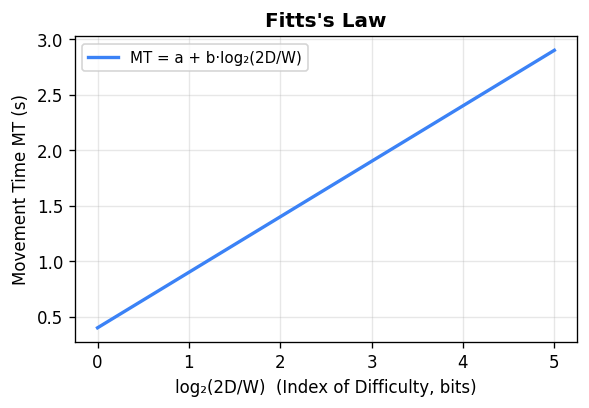
The practical design implications of Fitts’ Law are immediate and profound.
Make frequently used targets large. Doubling the target width reduces the ID by approximately 1 bit, cutting movement time proportionally. The “OK” button in a dialog box should be large.
Position frequently used targets close to expected pointer positions. Halving the distance D reduces the ID by approximately 1 bit. A context menu that appears at the cursor position is faster to use than a menu at the screen edge, because D is near zero at the cursor.
Screen edges and corners are infinitely wide targets. Because the pointer cannot travel beyond the screen edge, a target located at the screen edge effectively has infinite width in the direction of movement — the user can throw the mouse and be guaranteed to hit it. macOS places the menu bar at the absolute top of the screen, exploiting this property: despite being far from the typical pointer position, the infinite-height menu bar is faster to hit than in-window menu bars of finite height positioned anywhere within the window. Microsoft Windows, by contrast, places menu bars inside application windows at finite positions, making them slower to acquire according to Fitts’ Law.
Pie menus outperform linear menus for small item counts. In a pie menu, each item occupies a slice of the circle immediately surrounding the pointer. The distance D from pointer to each item is constant and small — much smaller than scrolling through a linear menu. For up to about 11 items, pie menus are consistently faster. For larger item counts, spatial organisation becomes harder and linear menus become competitive.
For real-world 2D targets, the target width W in the direction of movement must be determined. The theoretical ideal is to use the cross-sectional width of the target perpendicular to the approach angle, but the approach angle is not known in advance. The practical solution standardised in HCI research is to use the minimum of the target’s width and height, since the user will approach from the direction where the target is narrowest:
\[MT = a + b \log_2\!\left(\frac{D}{\min(W, H)} + 1\right)\]This conservative estimate ensures the model never underestimates difficulty. The Index of Performance (IP), defined as \(1/b\), measures how efficiently a given device translates physical movement into accurate cursor placement — a higher IP means the device is faster for a given ID. Different pointing devices (mouse, trackpad, stylus, joystick) have significantly different \(a\) and \(b\) values empirically measured from user studies.
A worked example from the slides: with a mouse where \(a = -107\) ms and \(b = 223\) ms/bit, clicking an 80×32 pixel Cancel button located 400 pixels away gives:
\[ID = \log_2\!\left(\frac{400}{32} + 1\right) = \log_2(13.5) \approx 3.75 \text{ bits}\]\[MT = -107 + 223 \times 3.75 \approx 729 \text{ ms}\]Motor space vs. visual space is a subtle but practically important distinction. The physical space in which the user’s hand moves is the motor space; the screen space in which the cursor appears is the visual space. Normally these are related by the CD gain, but they can be manipulated independently. The macOS Dock visually enlarges icons when the cursor approaches — the icons expand in visual (screen) space. However, because the expansion does not change where the user’s hand must move, it does not change the target’s size in motor space. According to Fitts’ Law calculated in motor space, the expanded Dock targets are no easier to click than the unexpanded ones. By contrast, dynamically slowing the cursor when it enters a target’s region (reducing the local CD gain) does make the target larger in motor space even though it looks identical in screen space — a technique sometimes called a “sticky” target that measurably improves acquisition speed.
The steering law extends Fitts’ Law to constrained path-following tasks: navigating through a cascaded menu’s submenus, moving a cursor along a narrow corridor, or controlling a surgical robot through a narrow channel. Developed by Zhai and Accot, the steering law predicts movement time as the integral of the instantaneous ID along the path. With only two endpoint goals:
\[MT = a + b \cdot \frac{A}{W}\]With N intermediate goals on the path:
\[MT = a + b \cdot N \cdot \frac{A}{W}\]For a hierarchical cascaded menu with multiple path segments, each segment contributes its own amplitude and width term, and the total time is the sum over all segments. This explains why a cascading submenu with a narrow corridor between the top-level item and the submenu is difficult: the narrow width W of that corridor (the tolerance before the submenu closes) drives up the steering law cost for that segment, making traversal slow and error-prone. Design solutions include placing submenus perpendicular to the parent item (so the user need only move horizontally before the submenu appears, without worrying about leaving the corridor) or using a delay before the submenu closes when the cursor exits.
Module 12: Future of Interaction
12.1 Ubiquitous Computing and the Internet of Things
The history of computing is a history of decentralization: from room-sized mainframes serving many users, to personal computers on desks, to laptops, to smartphones carried everywhere, to wearables on the body. Each transition made computation more pervasive and more personally intimate. The logical continuation is ubiquitous computing — the vision articulated by Mark Weiser at Xerox PARC in 1991 — in which computation is embedded in the environment itself, invisible until needed.
The Internet of Things (IoT) is the contemporary instantiation of this vision. Inexpensive microcontrollers and wireless networking have made it economically viable to embed computation in thermostats, lighting systems, appliances, door locks, vehicles, medical devices, and manufacturing equipment. The interaction design challenge for IoT is severe: these devices often have minimal or no dedicated display, must be usable by anyone in the household without training, and must fail gracefully. The cautionary example is the “smart” appliance that requires a firmware update before its basic physical function is accessible — a failure to prioritise the physical task over computational capabilities.
Ambient displays — devices that communicate information through subtle changes in their environment (color-changing light, sound level, texture) rather than through explicit screen content — are one design approach for IoT. They shift the interaction paradigm away from the focused attention required by screens toward peripheral awareness.
12.2 Virtual Reality and Augmented Reality
Virtual Reality (VR) immerses the user entirely in a synthetic environment. Head-mounted displays like the Oculus Quest track head position and orientation, rendering a stereoscopic scene that updates as the user moves. VR eliminates the mismatch between physical action and visual feedback that distinguishes desktop interfaces from physical reality — in principle, interaction in VR can be as natural as interaction with real objects.
In practice, VR faces fundamental interaction design challenges. There is no established equivalent of the desktop metaphor — no agreed vocabulary for selecting, moving, and manipulating virtual objects. Controller buttons, gaze-based selection, hand tracking, and voice commands have all been explored but none has achieved the breadth of adoption that WIMP achieved for desktops. VR also causes simulator sickness — nausea produced by the mismatch between visual motion and vestibular (inner ear) signals — when frame rates drop below about 90 fps or when the virtual scene’s motion does not match the user’s actual physical motion. The current state of VR is best characterised as technology that exceeds the available interaction paradigms — impressive hardware in search of compelling use cases.
Augmented Reality (AR) overlays synthetic elements on the user’s real-world visual field. Applications include: furniture placement previews (IKEA’s AR app allows seeing how a sofa would look in your living room before purchasing); navigation overlays on the physical environment (turn-by-turn arrows projected over the actual street); maintenance instructions overlaid on the actual equipment being serviced; and contextual information about objects and places identified by the camera.
AR is generally considered more practically tractable than VR because it preserves the user’s real-world context and does not require a complete alternate environment to be designed and rendered. Phone-based AR (using the phone camera and screen) is already mainstream; head-mounted AR (Microsoft HoloLens, Apple Vision Pro) enables hands-free use at the cost of wearing the device.
12.3 Touchless Interaction and Voice Interfaces
Touchless interaction encompasses gesture recognition (hand and body tracking without contact), eye tracking, and voice. These modalities are valuable in contexts where touch is impossible (sterile surgical environments, dirty work environments) or socially inappropriate. Their common challenge is disambiguation: any touchless system must determine which user actions are intentional and which are incidental.
The progression from mouse to touch to touchless interaction involves a systematic reduction in input state richness. A mouse is effectively a three-state device: the cursor can be positioned without any button contact (hover), the button can be held down while moving (drag), or the button can be clicked (down then up). A touch interface is a two-state device: the finger is either contacting the screen or not — there is no hover. A touchless gesture interface is a one-state device: the system is always sensing the user’s hand movements regardless of whether the user intends to interact. This reduction from three to one state means that touchless systems must find other mechanisms to distinguish intentional gestures from non-intentional movements — the reserved action problem.
Three solutions have been explored for the reserved action problem. A gesture delimiter — an invisible plane the user must push past, or a specific engagement gesture the user must perform first — provides a signal to the recogniser that intentional gesture input is beginning. This enables the full gestural space to be used once engaged, but requires agreement on where the plane is and risks false triggers if the plane boundary is poorly calibrated. Reserving a specific gesture as the engagement signal (such as pinching thumb and index finger together) reduces false positive errors because the reserved gesture is unlikely to occur naturally in non-gesture contexts, and reduces false negative errors because it is highly distinctive. The disadvantage is that the reserved gesture is no longer available as part of the application’s gesture vocabulary. Multi-modal input adds a physical button to a gesture interface — the hardware button handles navigation and system-level actions (exit, volume, home) while the gesture space is reserved entirely for application content interaction. This preserves the full gestural vocabulary for the application while providing a reliable, always-available mechanism for universal functions.
Gesture recognition systems balance two error types. False positive errors occur when the system recognises a gesture the user did not intend — making the system feel erratic and unpredictable. False negative errors occur when the user intentionally performs a gesture the system fails to recognise — making the system feel unresponsive and causing the user to question whether they performed the gesture correctly. These errors are in tension: increasing recognition sensitivity reduces false negatives but increases false positives; conservative recognition reduces false positives but increases false negatives. Current multitouch smartphones represent a well-calibrated point on this tradeoff, which is one reason they feel natural — false negative and false positive rates have been tuned through extensive user research and iterative hardware/software co-design.
Wake words — “Hey Siri,” “OK Google,” “Alexa” — are the speech interface’s solution to the reserved action problem: the device is always listening but only activates on a specific trigger phrase. The tradeoff is that the device must always be listening, which raises privacy concerns. Alexa’s accidental recording of private conversations and its transmission of those recordings to contacts has been documented. The always-on microphone is a fundamental architectural property of voice assistants, not an implementation defect, and it represents a genuine privacy-functionality tradeoff.
Voice interfaces excel at specific task categories: hands-free and eyes-free operation (driving navigation, kitchen timers), quick queries with well-specified answers (“what’s the weather in Toronto?”), and single-step device commands (“turn off the lights”). They struggle with tasks requiring complex information display (browsing a large product catalog, comparing many options visually), precise specification (selecting among many similar items), and long multi-step workflows where context is maintained across many exchanges.
Error categories in speech recognition are: rejection (the system refuses to act, asking for repetition); substitution (the wrong word is recognised); and insertion (words are hallucinated from background noise). False positives — responding to ambient conversation not directed at the device — and false negatives — failing to recognise a genuine command — represent the two sides of the sensitivity tradeoff. Systems can be tuned toward either false positives (aggressive response) or false negatives (conservative response) but cannot eliminate both simultaneously.
12.4 Multimodal and Implicit Interaction
The most capable future interaction systems will be multimodal: combining multiple input channels — touch, gesture, voice, gaze, context sensors — to achieve robustness and expressiveness that no single modality can provide. The classic multimodal interaction example is “put that there” — a command combining a pointing gesture (specifying what “that” is) with a voice command (specifying the action and destination). Neither modality alone is sufficient; together they are unambiguous.
Explicit interaction is intentional: the user deliberately performs an action to produce an intended effect. Implicit interaction infers user intent from behaviour and context without requiring a deliberate command — playing calm music when the user’s heart rate indicates stress, dimming the display when eye tracking shows the user is not looking at it, suggesting a route home when it is 5:00 pm on a weekday. Implicit interaction can be valuable when correct and deeply irritating when wrong. The user must feel in control; implicit systems that override user preferences without transparent rationale undermine that sense of control.
The design challenge for multimodal and implicit systems is not purely technical — it is epistemic. The system must make inferences about user intent from partial, noisy, ambiguous evidence. Every inference can be wrong. A system that acts on a wrong inference must make the wrongness visible, provide an easy path to correction, and avoid taking irreversible actions based on low-confidence inferences. These are exactly the principles of good error handling — visible feedback, easy recovery, and forgiveness — applied to an entirely new input layer.
Affective computing extends implicit interaction to recognise emotional states from physiological signals (heart rate, galvanic skin response) or behavioral signals (typing rhythm, facial expression). An application that detects rising stress and automatically simplifies the interface, or detects boredom and increases the challenge level of a game, is in principle valuable. In practice, the technical accuracy of affect recognition from readily available sensors remains limited, cultural variation in affect expression is substantial, and the privacy implications of continuous affective monitoring are considerable. These are active research challenges, not solved engineering problems.
Throughout all emerging interaction paradigms — voice, gesture, AR, IoT, affective computing — the foundational principles of this course remain constant. Users still form mental models that must match system behaviour. They still make mistakes that must be recoverable. They still vary enormously in capability, context, and experience. The principles Norman articulated in 1988 — affordances, constraints, mappings, visibility, feedback, metaphor — remain exactly as applicable to a voice interface or a VR application as they were to the Macintosh. The surfaces of interaction will continue to change as technology evolves.
The human on the other side will not.